As you may have seen from reading other content on this blog I dabble in the world of cryptocurrency. To help me on my position sizing I figured I’d create a little calculator app. Obviously, if you know me, that has to look sexy. So I decided to go on a journey into space using Xamarin.Forms!
What we’ll be creating today
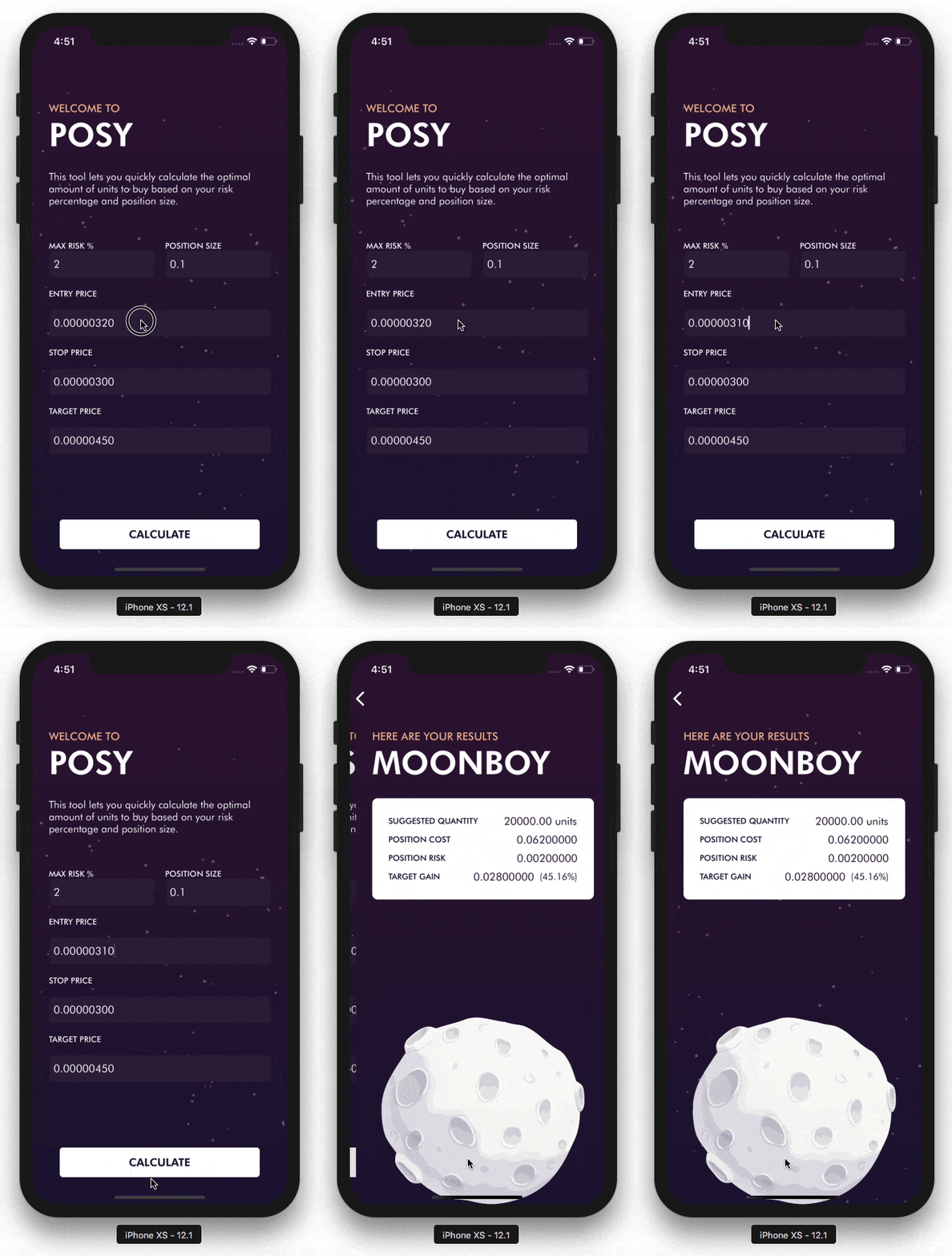
Let’s take a quick look at what we’re going to be covering today. The nitty-gritty calculations aren’t necessarily part of this post. I’m a UI guy, so that’s the more important part of this post we’ll be focussing on. The following parts comprise the interface you see in the moving GIF below:
- Gradient background on the content page.
- A randomly generated set of stars that rotates independently.
- A small card with the result of your calculations.
- A beautiful moon, also rotating independently.
- Some entry animation of controls.

Adding a gradient background
There are a lot of different ways to create this. You could just use an image or maybe something like SkiaSharp to render this gradient. In this case I’m using the native drawing tools by implementing a custom renderer (which is a common concept in Xamarin.Forms) for a custom class deriving from ContentPage. The first thing to add is 2 properties for both the start and the end color of the gradient to our custom page which will be used to control its appearance. The code for the custom renderers can be found on the Github page accompanying this post.
Random stars in the galaxy
To create a random set of stars I start with a simple image of a star. This is nothing more than a white circle with a small semi-transparent border. When the page loads I spin up a few instances of this image and add some randomizations to it in both size and their respective X and Y coordinates. The end result is a field of stars randomly scattered across the screen in different sizes.
To give the illusion of a star system I generate them in 5 batches of 20 stars at a time, each batch being contained within a single Grid component. I then rotate these Grid components infinitely at random speeds. By setting its pivot point to the center of the screen all these Grids rotate along the same path. This creates 5 sets of stars that move independently of one another which gives the illusion of a very dynamic galaxy :)
A card view to display results
If you’ve been following some of these UI related posts you’ll probably have seen this one before. In my previous post, where I made an awesome looking parallax carousel, I use the same control I will be using here. It consists of a custom ContentView called RoundedContentView which implements most of what we need, in this case, rounded corners.
A good looking moon rotating indefinitely
By now you should know that having good graphical assets is one of the key pillars of creating a cool looking app. I found the image of the moon I ended up using on the internet and it perfectly fit the style I was looking for. The rotation effect is nothing special. Since I needed some infinite rotation on multiple places I decided to make a method in my GradientContentPage to handle this rotation. An extension method on VisualElement would’ve been an alternative an probably cleaner option.
Entry animations on all the screens!
You can’t quite see it in the gif above, because it’s a later addition I did, but when the screens are first loaded the individual elements are animated onto the screen. The GIF below shows an example of some of the elements that move into screen when the screen is first presented.

So how do we go about doing this? The first, most important thing to realize is that it’s a good practice to initially position your elements at the final position they need to be in after the animation has completed. Because of this, the first step we need to take is move them out of the way before the screen becomes visible. To do so, I use the TranslateTo extension method in the constructor of the page and move all of the elements 1000 units away from their initial position.
When all of the elements are outside of the bounds of the screen, we can start animating them back in as soon as the view appears. To do so, I override the OnAppearing method and use the TranslateTo method to animate them back onto the screen. If you look closely, you will see that all of these elements have a different animation duration. This gives the effect of all the elements sliding onto the screen one after another. To ensure that all of the animations start at the same time they’re wrapped in a Task.WhenAll method, which only continues with the execution of our other code after all of the animations have finished.
Code & tools
You can find the code here: https://github.com/sthewissen/KickassUI.InSpace. If there’s something in there that you think can be done better in a different way or found a bug; feel free to submit a PR. I’m always looking to learn :)
The following tools were used to create this app:
- LiveXAML – Live simulator updates for your XAML code – http://www.livexaml.com

