If you frequent this blog you probably know I like creating cool-looking stuff in Xamarin.Forms. Since that’s what I like doing, why would I stop? So here’s another one!
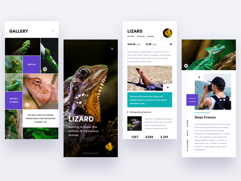
Finding inspiration for one of these can be really simple. There are numerous sites out there like Behance or Dribbble where a lot of creative artists share what they’ve made. This post is no different. I got the idea for this post from this awesome looking design by Yi Li.
 Yi Li’s design for an encyclopedia type of app.
Bringing it into Xamarin.Forms
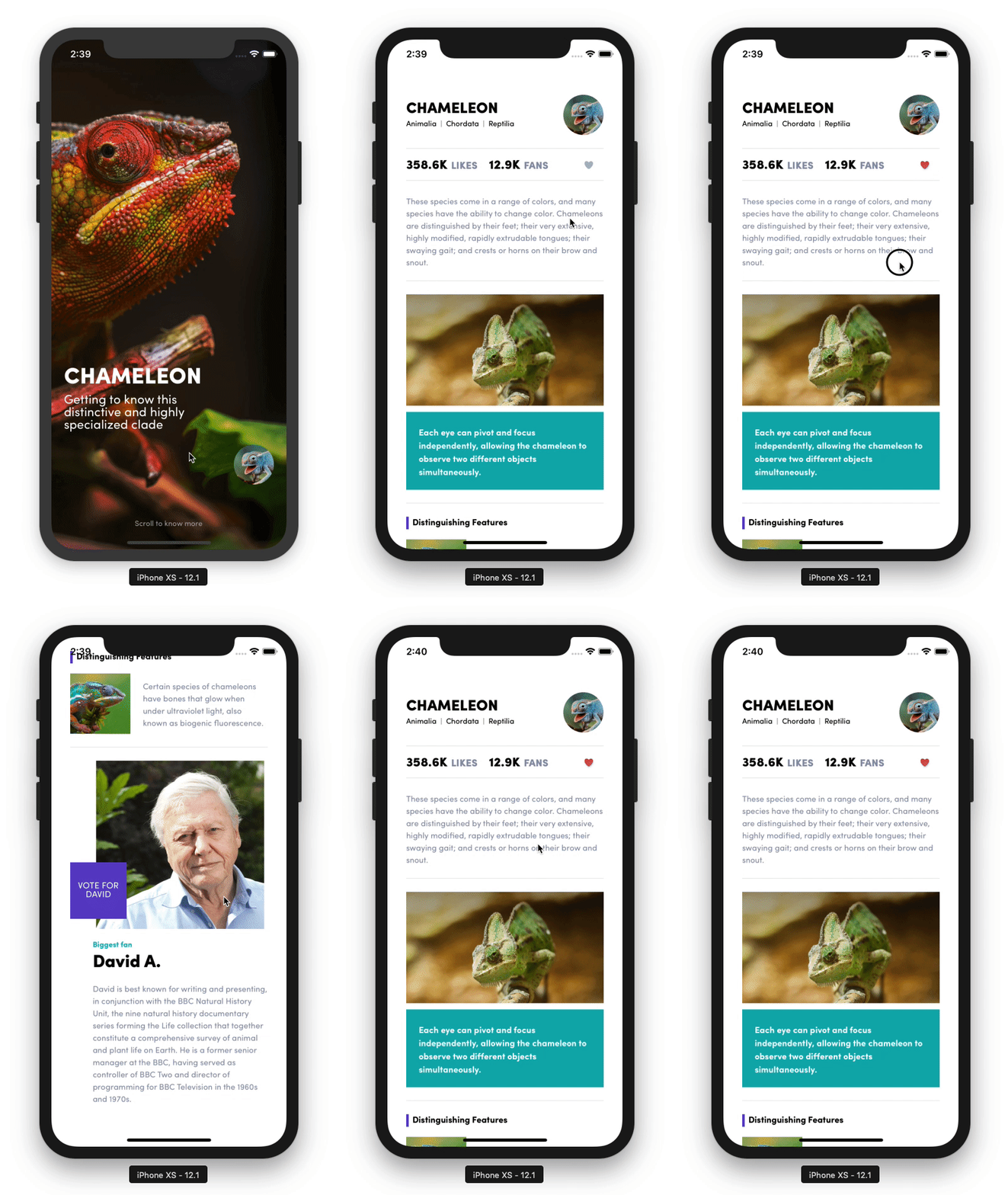
So, how do we manage to get this into Xamarin.Forms? First, we need to figure out how this should work based on the pictures. I decided to leave the left-most screen out of it and decided the opening screen would be the full-screen picture. When swiping up I’d like to show the other two screens and be able to scroll through them as if they were above one another.
This, however, poses a challenge. The first part of the screen (the cover image) should scroll up and snap into place, whereas the second part just needs to act like a regular scroll. We don’t know how long the content will be because it could be dynamic if you were to implement it with actual content.
Most of the other items can be implemented by getting a bit creative with StackLayout and Grid layouts. Or as David Ortinau recently put it in a Twitter conversation we had: by making use of that degree in HorizontalOptions and VerticalOptions.
hehe, I know. Still, I want to make it easier and more accessible for people to make nice interaction and animations by default without taking a graduate course in HorizontalOptions/VerticalOptions. :) David Ortinau (@davidortinau) February 2, 2019
Getting ScrollView to play along
Like I described earlier the existing ScrollView classs not be able to facilitate the behavior we want to implement. The solution I came up with was to not use a ScrollView at all for the snapping part. Fake it till you make it!
First, we show a full-screen picture. This is a simple full-screen StackLayout with an image in it which is fitted while maintaining the aspect ratio. By adding a GestureRecognizer we can make it so that swiping up triggers a translate animation that moves it out of the screen and moves the content onto the screen.
The actual content is wrapped in a regular ScrollView, which enables it to be dynamic in height. Most of the other stuff in the content part of this example is done by creatively using StackLayout so you can check that out yourself in the code.
Garnishing the dish with some animation.
One thing the app does that might be worth mentioning is the little heart icon animation that is played when you press it. This is done using the Lottie framework, which is a framework that lets you create cross-platform animations in Adobe After Effects. There’s a Xamarin binding for this library as well which can be used in Xamarin.Forms & using it is fairly simple.
After adding the NuGet packages and initializing the Lottie framework we can add an AnimationView to our XAML file. This contains a link to the JSON file containing all the details of our animation. These JSON files can be exported from After Effects (out of scope for this post) or found on sites like LottieFiles. We add a Click handler that starts the animation or resets the animation state back to the first frame when we want to unlike the item. This gives us:

Code & tools
You can find the code here: https://github.com/sthewissen/KickassUI.Chameleon. If there’s something in there that you think can be done better in a different way or found a bug; feel free to submit a PR. I’m always looking to learn :)
The following tools were used to create this app:
- FFImageLoading – Caching and transforming images – https://github.com/luberda-molinet/FFImageLoading
- LiveXAML – Live simulator updates for your XAML code – http://www.livexaml.com
- Lottie - Cross-platform animations - https://airbnb.design/lottie/ - https://github.com/martijn00/LottieXamarin
- Xamarin Essentials - Common cross-platform APIs - https://docs.microsoft.com/en-us/xamarin/essentials/

