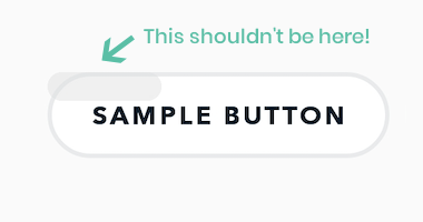
While building our latest Xamarin app we recently ran into an issue where a button on Android would only have a partial ripple effect. This post explores the workaround we ended up implementing.
What exactly do you mean?
The screenshot below shows how each of the buttons in our app looks when tapping them. As you can see the ripple effect isn’t applied on the entire button but just a small fraction in the top-left corner. This really breaks the user experience and didn’t pass our acceptance test and rightfully so.

So, where does one start on an issue like this? We all know that all good developers copy their code from StackOverflow, so that’s always a nice starting point. Whenever it’s Xamarin.Forms related, however, I find it’s also a good idea to check their existing GitHub issues. The latter of these two yielded instant results in the form of this issue.
The ripple problem
Browsing through the issue we found it becomes apparent that we aren’t the only ones with this problem. This one goes back a while. A few years to be precise. The fact that it was still open instantly made my mood ring turn a bright yellow though.
The first thing that stands out from the issue is that it’s apparently a Samsung-only issue. What good fortune that the test device I had lying in front of me was also a Samsung! That explains why we saw it occurring. Two other things stand out in all of the discussion going on in the aforementioned issue:
- A few people have some form of a workaround in place using custom renderers.
- It seems to be non-existent when using Material button instead.
We tried the suggested renderers, but with the number of different buttons and styling existing in our app, it would break the UI on a lot of other buttons. Swapping in the Material styling wasn’t going to cut it for our designers either, so we went with the only solution we had left. Create our own specific custom renderer variation.
Our solution, or rather… workaround
As I’ve mentioned before, our app has a lot of different kinds of buttons. Rounded corners, borders, background colors, all sorts of flavors make an appearance in some form. Keeping those variations was important. If we couldn’t have a decent ripple we would need some other way to inform the user that the button was touched while simultaneously overriding the native ripple effect.
What we ended up doing was to replicate the button’s normal state in code, apply a slight color variation to it, and set it as the button’s pressed state. We ended up decreasing the luminosity of the button’s background color by 5% making the pressed state slightly darker than the normal state. This might not work when you have a really dark button color in your app, but the code is easily adaptable to apply more logic to this.
Disclaimer: I don’t really wear mood rings. I swear.

