A while ago I wrote a blog about using the concept of a base page in Xamarin.Forms. Since people are still looking at options to swap out native controls for custom implementations due to complex visual requirements it might be worth revisiting this topic!
Due to the length of this blog post, I’ve added an index allowing you to skip to all of the relevant topics:
What is a base page?
My original post was based on talks given by Glenn Versweyveld where he explains the basic concept. It involves building a custom ContentPage class that has specific sections in it that other pages can add content to. This approach is primarily based on inheritance where the BaseContentPage pushes its behavior down the inheritance chain. Recently, I’ve been exploring a concept that is based more on composition using a custom control. In this concept, we use regular ContentPages and add a custom wrapper control on the pages that need it.
To get this show on the road we will need a sample to build off of. I’ve found this fairly simple design on Dribbble which would be suited just fine for the concept we are trying to explore here. It has a custom tab bar at the bottom and a simple app frame in the form of a navigation bar at the top. We can even use some fancy new Xamarin.Forms controls like CarouselView and CollectionView. This will be fun!
 The design we will try to implement using an AppFrame.
Mobile app design by Outcrowd as published on Dribbble.
Quickly exploring ContentView
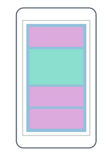
This post will heavily feature the use of ContentView(s). If you don’t know about these, you can read up on them in the Microsoft Docs. When I first started tinkering around with this concept I was kind of confused by how ContentView actually works. It did exactly the opposite of what I expected. Allow me to explain how it works using the graphic below.
 A concept of ContentView.
The ContentView is a templatable control. Each ContentView (blue) exposes a ControlTemplate property that can be used to define or override the appearance of the control. The content (green) remains the same, but everything around it can be changed by using this control template. In this sample, the purple boxes represent controls defined inside of the control template.
The Content inside a ContentView is positioned wherever we put a ContentPresenter control within the ControlTemplate. This essentially means we can dynamically swap out the container around our actual content. Useful, but if we want to create a consistent looking app frame we need our control template to be fairly static. We will not swap it out very often, if at all. However, ControlTemplate has other scenarios where it proves more useful, but we’ll look at those later.
Introducing the AppFrame
Since this concept moves away from having a base page doing the heavy lifting (we are using regular ContentPages) we will need a new name for this concept. I settled on AppFrame, which is also what I named the control we will work on throughout this post. It all starts out with a humble little Grid though. This Grid will contain all the “chrome” of our app and the actual content. Looking at the sample app shown in the screenshot above we can already see that we need a row for the top title/navigation bar, one for the actual content and one for the bottom tab bar.
The top row containing all our main navigation is a simple 3-column setup with buttons on the left and right and a title in the middle. By setting these up as bindable properties on AppFrame we can bind values to them from each individual page. This goes for both the commands and the text/iconography.
The actual content is abstracted away behind a bindable property as well. We can once again set it using XAML on the actual ContentPage itself.
Intermediate conclusion
We created a simple custom app chrome as a singular control that we can re-use across our app to wrap content on specific pages. Adding basic bindable properties allows us to change parts of it. Any additional behavior we would want to include can be added to the AppFrame control itself and will be available to every page that has an AppFrame on it. The source code up to this point can be found on my GitHub.
In the next part…
Because this post has gone on for long enough already, I’ve decided to split it up into multiple pieces. In the next instalment, we will look at creating a simple popup/overlay functionality which allows you to swap out the template used for the overlay. This is great if you want to have different templates for different types of messages such as alerts, informational messages or menus.

