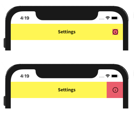
We can interact with our phones in different ways, but the most commonly used one is through touch. But what makes for good touch targets and how can we improve upon what we get out of the box in Xamarin.Forms? Let’s take a look! Allow me to preface this post with the fact that I’m no accessibility expert. Therefore, this post will not go big on it, but will rather highlight some quick tips.
Bigger is better & space adequately
Nothing is as frustrating as tapping on a button but nothing happens. This could be caused by a touch target that is smaller than it should be. In our apps, we want to have our users hitting the target, not force them to exactly hit the bullseye. Therefore, our touch targets should be as big as they can realistically be.
Our goal as a developer should be to have our users complete their goals as often as possible. If the button is too small this simply won’t happen. It also puts additional strain on the user, making the success rate of our app go down.
Let’s take a look at the example below. We’ve created a button and given it an icon and a tap command. The button might size itself to the text we’ve put into it, meaning it actually has quite a small surface. By adding Padding to the button, we can greatly increase the touch target, while keeping our look exactly the same. Do note, that while the same visual effect can be achieved using Margin, this margin will not typically be part of the touch target.
 Opt for padding over margin.
Making our design breathe and not cramming all our elements together is a good practice anyway, so using our interactive elements to create that additional space is a great way to do it. By limiting the number of elements on the screen we can allow our key touch targets to be larger and spaced apart further, making them easier to tap.
Different form factors & audience
Imagine we already know that the device we’ll be developing for has a smaller screen. It might even be a watch app that has limited screen real-estate. If that’s the case, we don’t want to just shrink the touch targets to fit everything on the screen, but instead, reconsider our layout to incorporate e.g. gestures or voice control.
Our audience is another reason for creating bigger touch targets. Little kids lack the precise movement as they still need to develop those skills. The elderly might have shaky hands meaning that precisely tapping things could be challenging. The fact that we as developers might be able to easily find our way through an app does not mean that everyone else will.
Look towards existing guidelines
Both Apple and Android have published guidelines on how big touch targets should be. Getting a basic grip on what these are will help you moving forward. Apple’s Human Interface Guidelines for example suggest the following:
Provide ample touch targets for interactive elements. Try to maintain a minimum tappable area of 44pt x 44pt for all controls. Human Interface Guidelines - Apple
Moving on to Android, we can find some information in their Material Design Guidelines. Here Google defines a minimum size for tappable elements at 48 x 48 density pixels. For icons, these sizes are fine. But if you can go bigger you definitely should!
Taking your touch targets to the next level
To take our interactions to the next level, we’re going to be using the TouchEffect NuGet package by Andrei Misiukevich. This NuGet provides the ability to create views with touch effects without using TapGestureRecognizer. With it, we can change the appearance of any control in response to touch events, either directly via XAML code or with custom logic hooked up to the events that this plugin exposes.
What kind of things can we do? Well, among others, we can do rotating, translating, scaling and re-coloring elements on pressed, or even hovered. This allows you to do something like this for example:
 Animating our taps, being a bit creative.
All of this is done through attached properties that you can add to any view that you like. A recent sample I used for my MVP app looks like this:
Look at the repo to see what other properties exist and how you can make the most of your touch effects.
In the Xamarin.CommunityToolkit soon™!
Andrei has been so kind as to submit all of these helpers into the Xamarin.CommunityToolkit. If you’re unaware of what that is, it’s a community-ran set of NuGet packages that offer a lot of features that Xamarin.Forms currently lacks. Some of it is bits of common code that you’re replicating across apps (such as converters), some of it is entirely custom views like the awesome CameraView, and now also all of these touch effects. Check it out if you haven’t already!
Conclusion
Designing good touch targets is the basis of designing for mobile. All elements should be big enough and spaced far enough apart to ensure that users reach their goals using the app. We also looked at some of the cool community-built solutions which allow us to be a bit more creative with these touch targets.

