Dark mode; it’s all the rage in apps these days. Its main goal seems to be saving our eyes from burning out when reading things in a dark environment, but is that true?
The theory behind it
When browsing the internet we can find numerous articles about dark mode, why it exists, and whether or not it’s actually a good thing. There are a lot of differing opinions on these questions, so without going into the details too much here are a few points that come up often:
- It helps against eye strain
- Battery-life is improved on certain screen types
- It makes a piece of text more legible
Scientists’ opinions are still divided on most of those claims. In the end, for me, it comes down to personal preference as no one pair of eyes is created equal. The fact of the matter is, a lot of apps and companies are adopting dark mode, regardless of possible benefits. The alternative aesthetic seems to be the biggest driver in companies banking on dark mode making it one of the most requested features over the past few years So let’s join them in seeing how we can implement it ourselves.
Designing your own dark mode
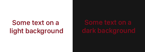
One could be tempted to think that implementing dark mode is as simple as essentially flipping our color scheme. However, there’s more to it than that. We might be using certain colors that vibe really well with a light background. By just flipping colors these could become hard to read on a darker background.

 Not every color vibes well with a dark background.
I personally think that designing a good dark mode style is equally as hard as creating a regular design. However, there are some pointers we can adhere to when setting up our color scheme.
Don’t go for pure black (#000000) Contrary to what we might think, pure white text on a pure black background will put a bigger strain on your eyes. Applications typically choose softer black and white combinations.
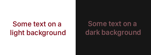
Use less saturated colors The sample given above already nicely illustrates this. The very saturated red on a dark background creates a very unclear picture. By desaturating our primary colors we will achieve a better effect.
 More saturation makes text stand out on a dark background.
Meet the accessibility standards when it comes to contrast Your text should remain legible for everyone. Following existing accessibility standards can help with that. Existing design systems such as Material Design also have pretty good documentation on dark mode and the theories behind which kinds of colors to use.
Dare to be different I’ve mentioned it a few times already, but dark mode does not need to be a simple color flip of existing elements. You can experiment with other ideas such as applying a different color fill to elements that didn’t have a color fill in light mode.
Ok, now let’s build it!
Implementing dark mode in Xamarin.Forms only takes a few steps. The first thing we need to be aware of is the AppThemeBinding. This is a type of binding that allows us to provide different values for a property depending on whether the app is currently in light or dark mode. It can be applied pretty much everywhere; images, text colors, font size, text etc.
Once all of our bindings are in place, we can start getting and setting the different themes. Luckily, Xamarin.Forms exposes two properties we can use to do exactly that!
Making the user choose a theme
Now, let’s up the ante just a little bit and create a screen that allows the user to pick their own theme from within the app itself. This viewmodel is taken from my MVP app, where you can see the whole thing in the flesh, but it should paint a general picture of the idea behind it:
So what happens here? First, we populate a list with the options the user can choose from: the device default, or a light or dark theme. Then we define a command which handles tapping on an option from the list. The command immediately sets the theme and stores this preference using the awesome Xamarin.Essentials Preferences APIs. The only thing missing now is to set this preference on app startup. That way it won’t go back to its default setting the next time we start the app. This is done by adding a single line in our App.xaml.cs constructor.
Conclusion
In this post, we explored what it takes to get your mode ready for dark mode by using AppThemeBinding. We also explored some pointers on what makes up a good dark mode theme and why we’re even doing it. Hopefully, this will get you started on your journey of creating an awesome dark mode theme! If you do, be sure to share it with me on Twitter!

