I love tinkering with UI. There, I said it. Even though I’m a developer first and foremost I cannot help the fact that any mobile app UI I create has to look fancy. However most of my development work takes place in Xamarin Forms. Can those two worlds be combined?
The inspiration for this post
To quickly answer the question in the previous paragraph: hell yeah. I recently came across this post by Adam Pedley which talks about Xamarin Forms and the misconceptions that exist around creating a kickass UI with it. I couldn’t have phrased it any better myself and his Instagram sample proves his point. This paragraph basically says it all:
Xamarin Forms continues to be dragged down by old viewpoints, that it is unfit for popular, polished, and/or large scale applications. And that it could not possibly compare to a native implementation. Xamarin Forms apps are native applications, and have the full capabilities of one, the only difference is that you may need to implement CustomRenderers or platform specific code, to achieve things that Xamarin Forms has not yet, or can not yet implement, in a cross platform manner. Adam Pedley
Adam’s post and an older series called “Xamarin Forms in Anger” by Adam Wolf got me inspired to contribute my 2 cents to the cause. In this post and possible future posts I will be dissecting some of the most popular apps’ UI and trying to recreate (part of) it using Xamarin Forms. The source code for these project will be made available on my Github page. Please note that these will not be entirely pixel perfect functional recreations but are meant to demonstrate that the UI concept is possible in Xamarin.Forms. If you thinker with these a bit more you’ll definitely be able to make them pixel perfect. So let’s get started with Twitter!
The feed screen
This is the first screen you see when you open the Twitter app; your very own feed. It’s quite basic and if you have the correct iconography and fonts it’s pretty easy to recreate. A few custom renderers are needed on iOS to remove the titles from the tabbar so it only displays icons. Having a custom view in the NavigationBar is not doable in out-of-the-box Xamarin Forms. In this case I replaced the default hamburger menu icon with my own avatar and created a renderer to remove the default TintColor iOS adds to it. Alternatively you could use the same renderer to pop a custom UIView in theNavigationBar that handles popping the menu.
To get the rounded corners on the images and the circular profile images I used FFImageLoading and its tranformations. I have yet to figure out how to get it to crop the way the Twitter app does though. You will probably need to write a custom transformation for that if you want to keep using FFImageLoading. Feel free to create a PR for it if you know how to do it though! Other than that I’d say I came pretty close.
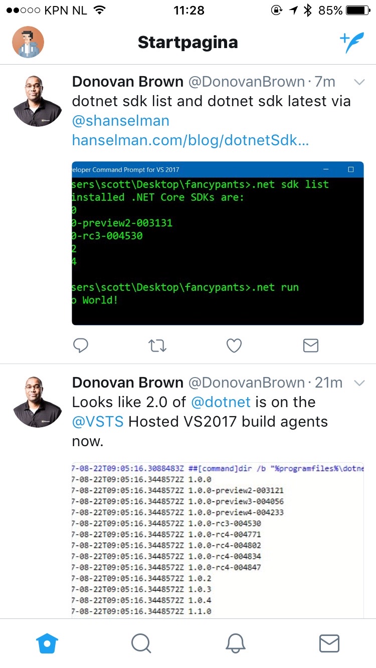 Actual Twitter app
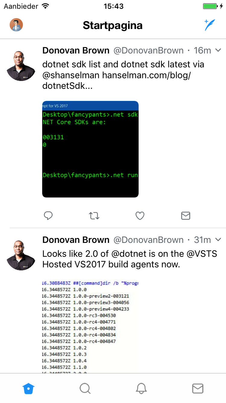 Xamarin Forms version of Twitter
And what about Android?
Let me start by stating that I am no Android styling wizard. Coming from an iOS world I’ve always had more affinity with styling iOS apps than Android apps. It’s what I always start with when prototyping my apps just because it feels natural to me. The amount of XML files involved in the Android styling process usually only succeeds in confusing me. Nevertheless the Android version of the app also needs some love to get up to par with its iOS counterpart so here’s what I did.
Disclaimer: Some of these tweaks might have been possible in an easier fashion. Feel free to PR the code to educate me :)
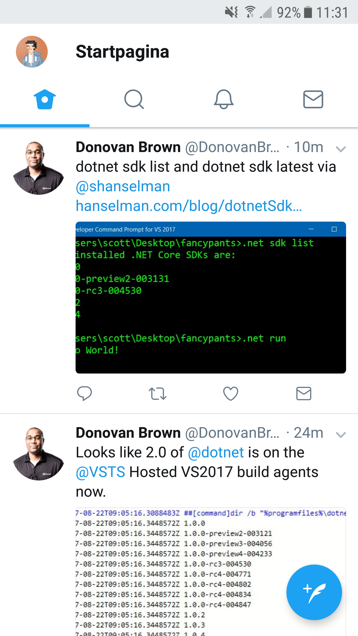 The Android Twitter app
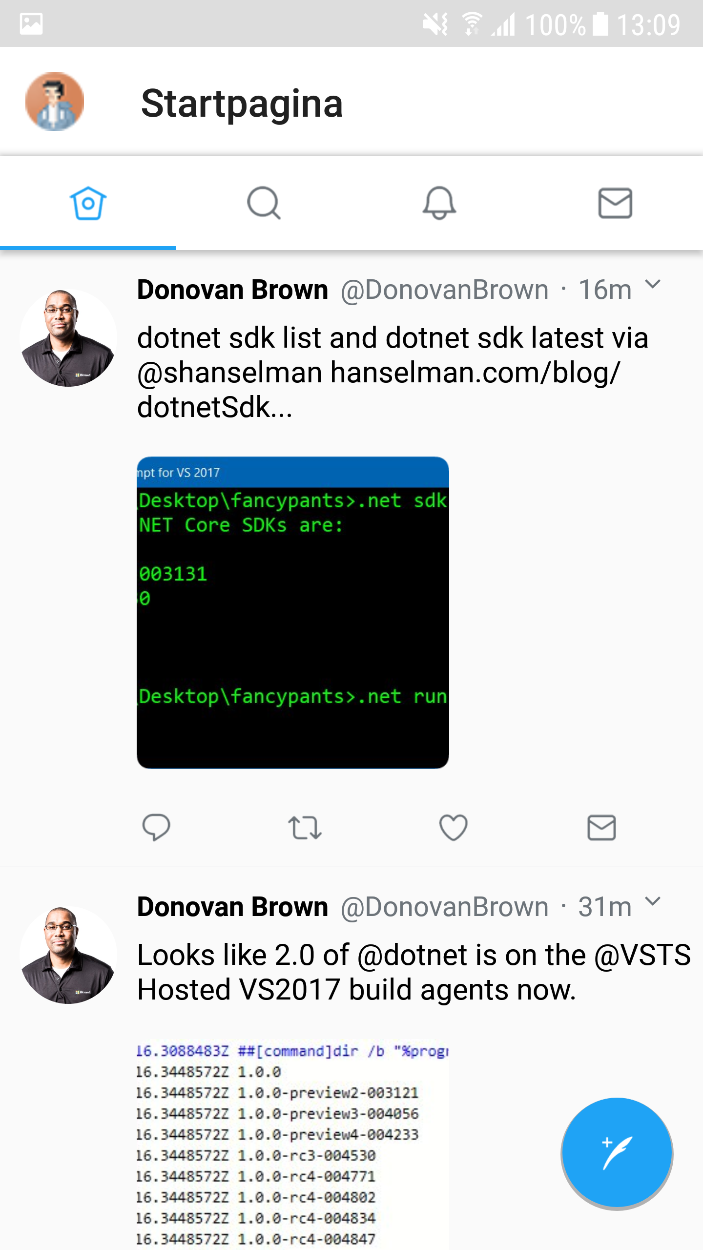 Xamarin Forms Twitter main page
To get the selected tab to show up colored I used James Montemagno’s tutorial and his custom renderer to get this going. I defined my colors in an xml file and added that to my Resources folder. To remove the titles you can simply set them to an empty string when defining your tabs. Since we also remove them on iOS this is the easiest solution.
Changing the hamburger icon for the master-detail view proved a bit more complicated than I thought it would. I tried settings the Icon property of the menu page but no luck there. I ended up creating a custom renderer for it which simply swaps out the existing icon for a new one.
The only thing I couldn’t figure out is how to remove the drop shadow effect that is applied to the Toolbar or the top of the TabBar. Adding the shadow itself requires you to add the elevation property to your Tabbar definition.
The menu
Most of the menu is pretty straightforward. The users profile item makes an appearance again as well as some other buttons represented by custom icons. In my sample I used the FontAwesome font to quickly create these buttons. Obviously with the right icons it would look almost spot on. Most of these items are tappable and navigate to a different screen which you can easily achieve with a TapGestureRecognizer. Also there are some differences in how some items are presented which can pretty much all be solved using the OnPlatform tag.
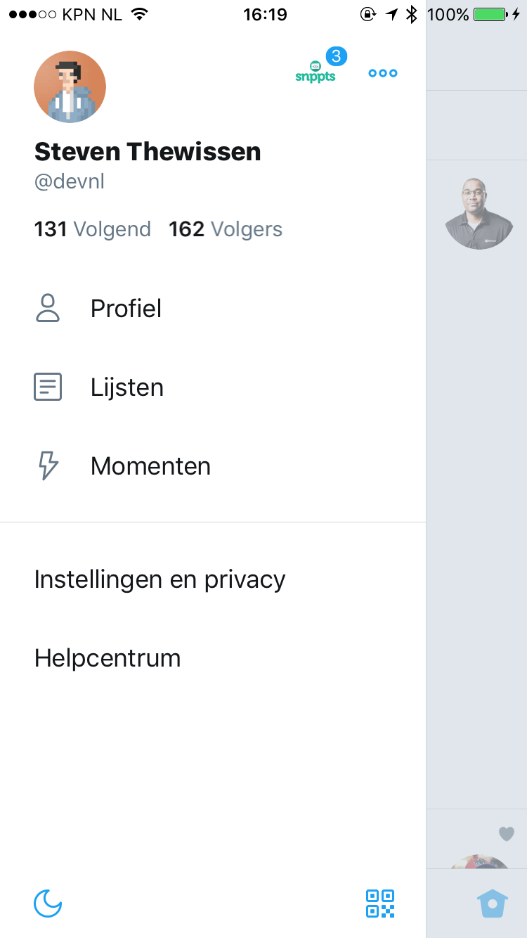 The menu in the Twitter iOS app
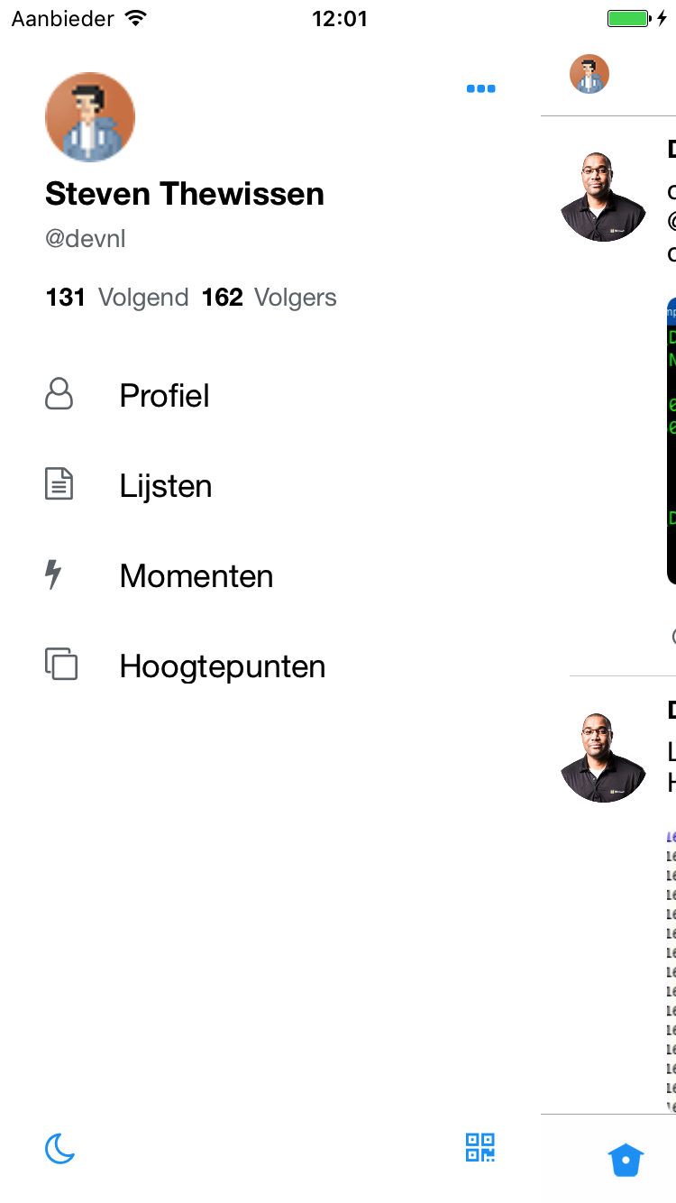 Menu in the Xamarin Forms iOS app
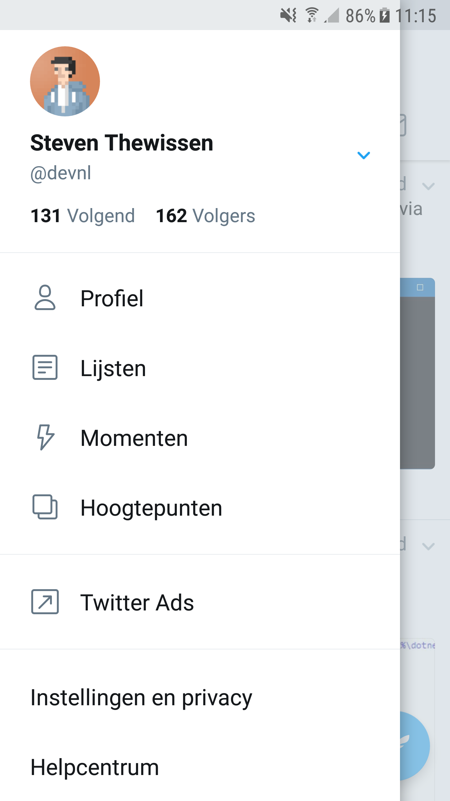 The Twitter Android menu
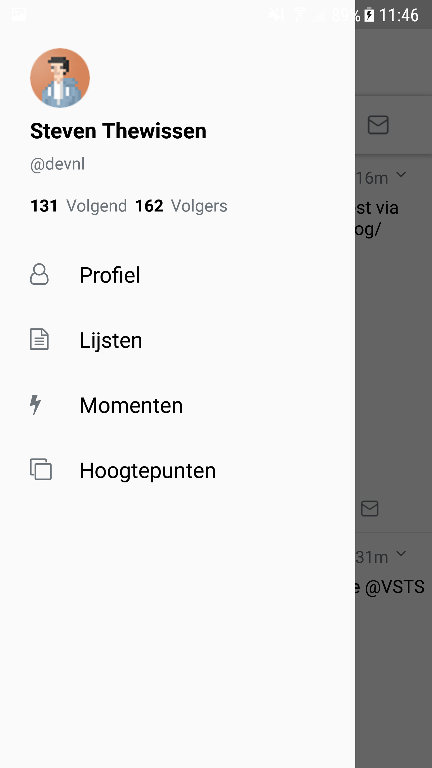 Xamarin Forms Android menu
In closing…
These are just a few of the screens that the Twitter app has. Most of the other ones are your basic ListViews with a template suited to what the screen is displaying. There are some fancier animations in there for example when tapping the like button but this is something that a product like Lottie could take care of for you. If you want to look at the code you can check out my Github repo for this app. If there’s anything you want to add or change don’t hesitate to create a PR for it!
The following tools were used to create this app:
- FreshMvvm - Simple MVVM framework - https://github.com/rid00z/FreshMvvm
- FFImageLoading - Caching and transforming images - https://github.com/luberda-molinet/FFImageLoading
- NControl - Android floating action button - https://github.com/chrfalch/NControl

