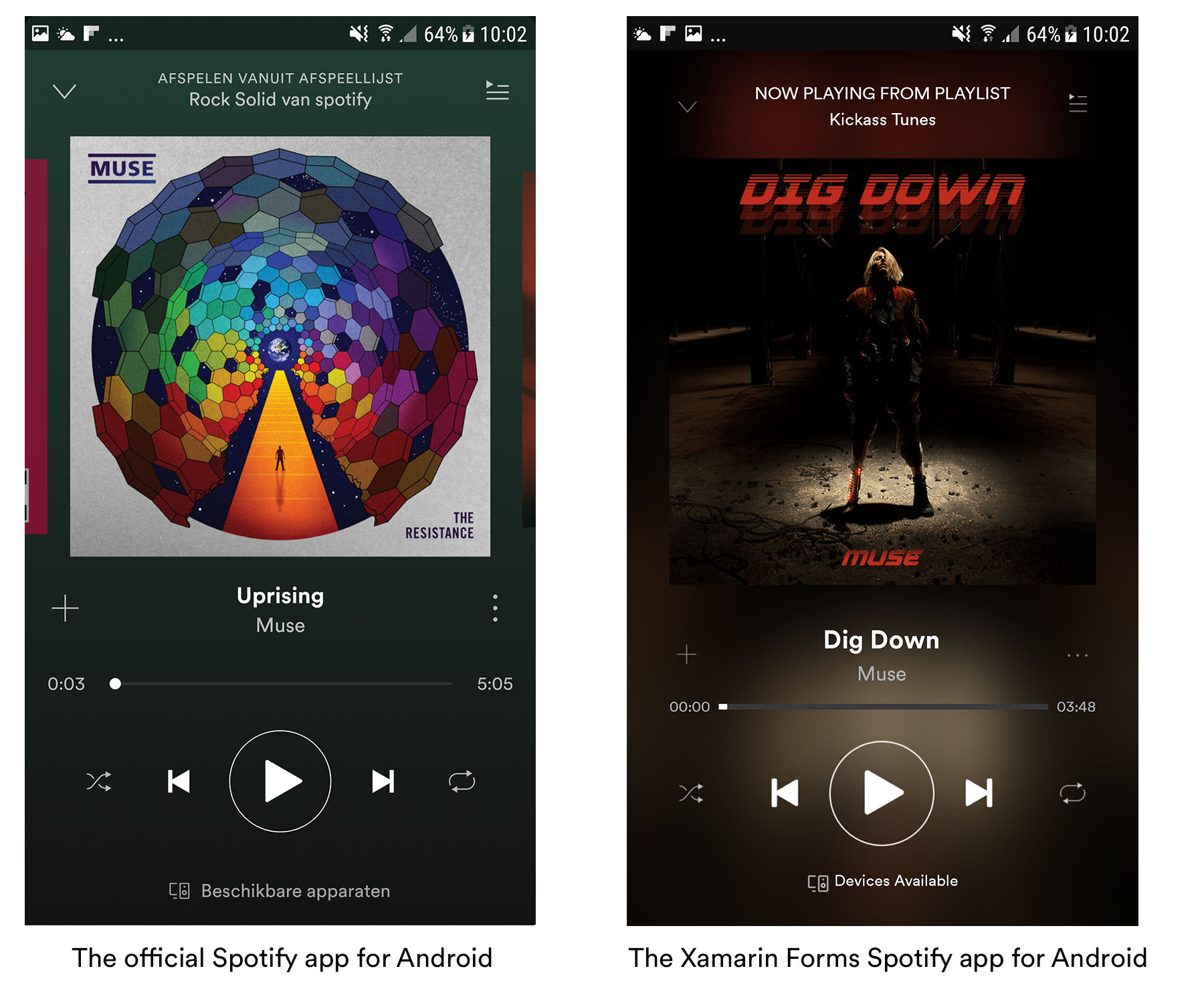
It seems like people really like this kind of content, so I decided to keep it up for now. This is the third instalment in this series already and this time we’re going to be taking a look at the Spotify UI!
Previous posts in this series
In case you missed it here are the links to the previous posts in this series:
- Creating a good-looking Xamarin Forms UI: Twitter
- Creating a good-looking Xamarin Forms UI: Runkeeper
- Creating a good-looking Xamarin Forms UI: Spotify (this post)
Crafting the Spotify UI in Xamarin Forms (iOS)
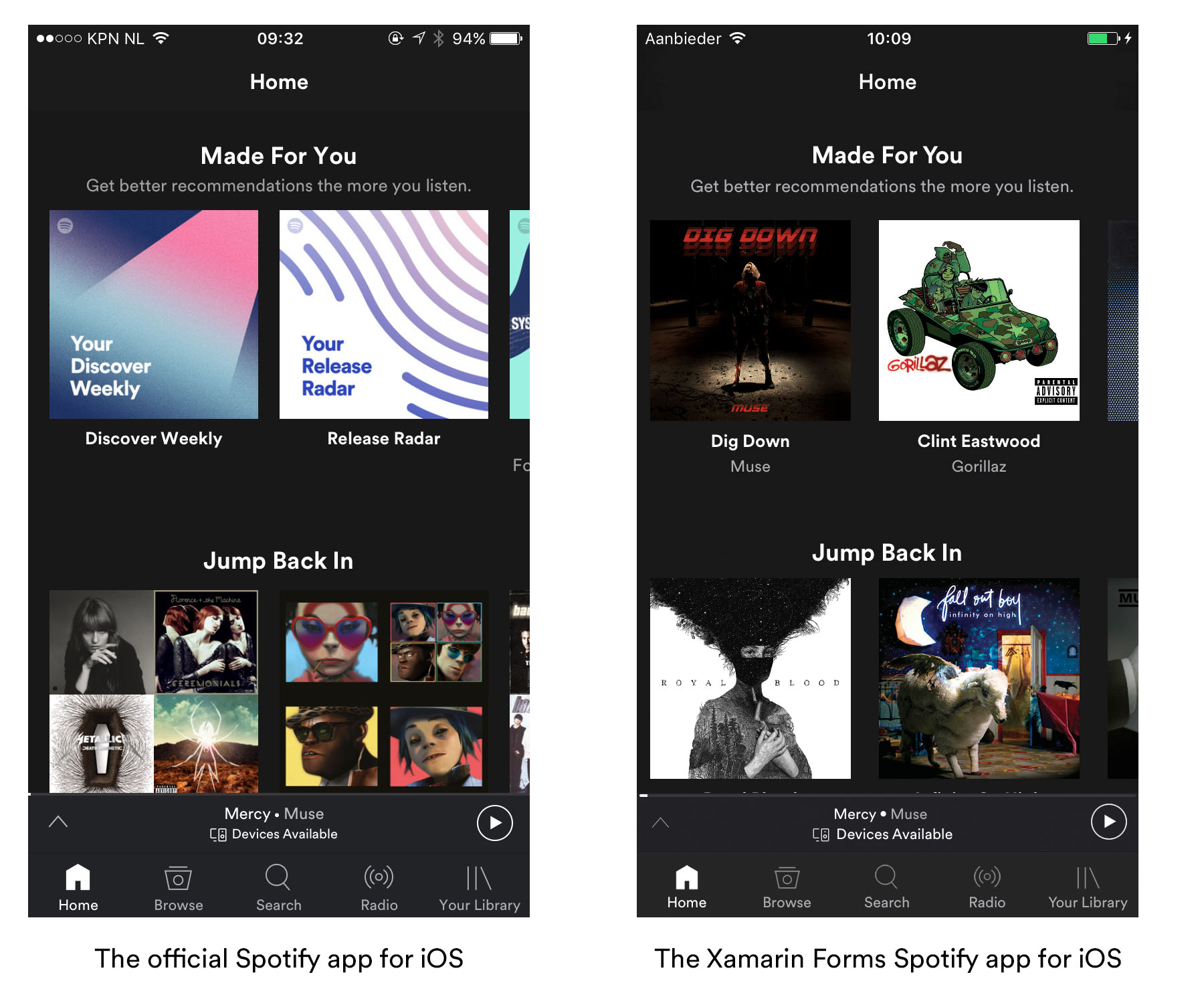
When looking at the main screen of the Spotify app on iOS there are a few notable things happening:
- Horizontal scroll views containing the album covers / playlist covers.
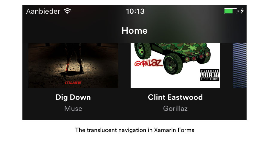
- A translucent navigation bar that blurs the content below it.
The song/playlist/album scroller
The out of the box ScrollView in Xamarin Forms is not a bindable control. What we’re looking to create is a control that we can bind data to and has the ability to be templated. While it doesn’t take a whole lot of code to create this there is a ready-made solution out there in the form of Fabio Cozzolino’s TLScrollView. It only takes a few lines of XAML code to create the necessary template:
Translucent navigation bar
The translucent NavigationBar takes a bit more effort and we fix that by using a custom renderer. We start by removing any background images and shadow images from the NavigationBar instance and set it to be translucent. When that is done we add an instance of a UIVisualEffectView to the back of our NavigationBar. This is a native UIView that can give one of a few effects to another UIView. In this case we use the UIBlurEffect which blurs whatever passes through our navigation bar.
Creating the player UI for iOS
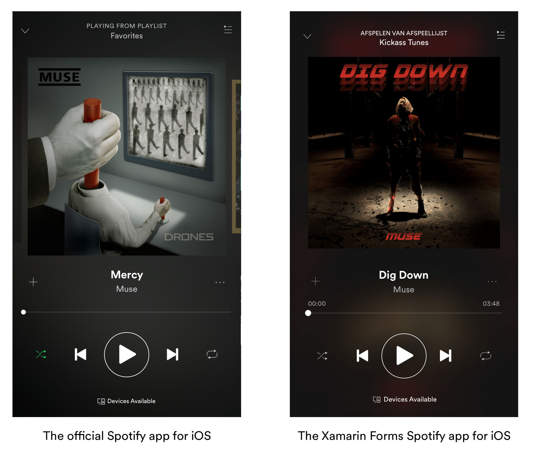
Moving on to the audio player screen we once again see a few things of note:
- A blurred version of the album cover on the background
- A slider indicating song progress
- A custom title in the navigation bar with a hidden status bar
Blurred fullscreen background
To create the blurred background we only need one line of code because we can leverage something Xamarin calls platform specifics. This is a collection of cross-platform implementations of platform specific functionalities. They’re yet another great tool for cross-platform developers to use besides Effects and Custom Renderers. One of those platform specifics is a blur effect which gets applied to the cover image that is contained in a fullscreen AbsoluteLayout.
Audio progress slider
The audio progress slider is a custom version of the existing Slider control. It is bound to the song length and is fully functional in this app. As soon as you press the play button a dummy timer ticks each second and updates the slider. Even scrolling through your song works like a charm! The only thing it doesn’t do is produce some actual sound. Its look and feel is entirely controlled by a custom renderer.
Custom title view
The custom title view is added by overriding the WillMoveToParentViewController method in the custom PageRenderer. From here we can access the TitleView of the navigation bar which we can add custom content to. By creating a custom implementation of ContentPage and adding a bindable Subtitle property we can set these titles from our shared code.
Crafting the Spotify UI in Xamarin Forms (Android)
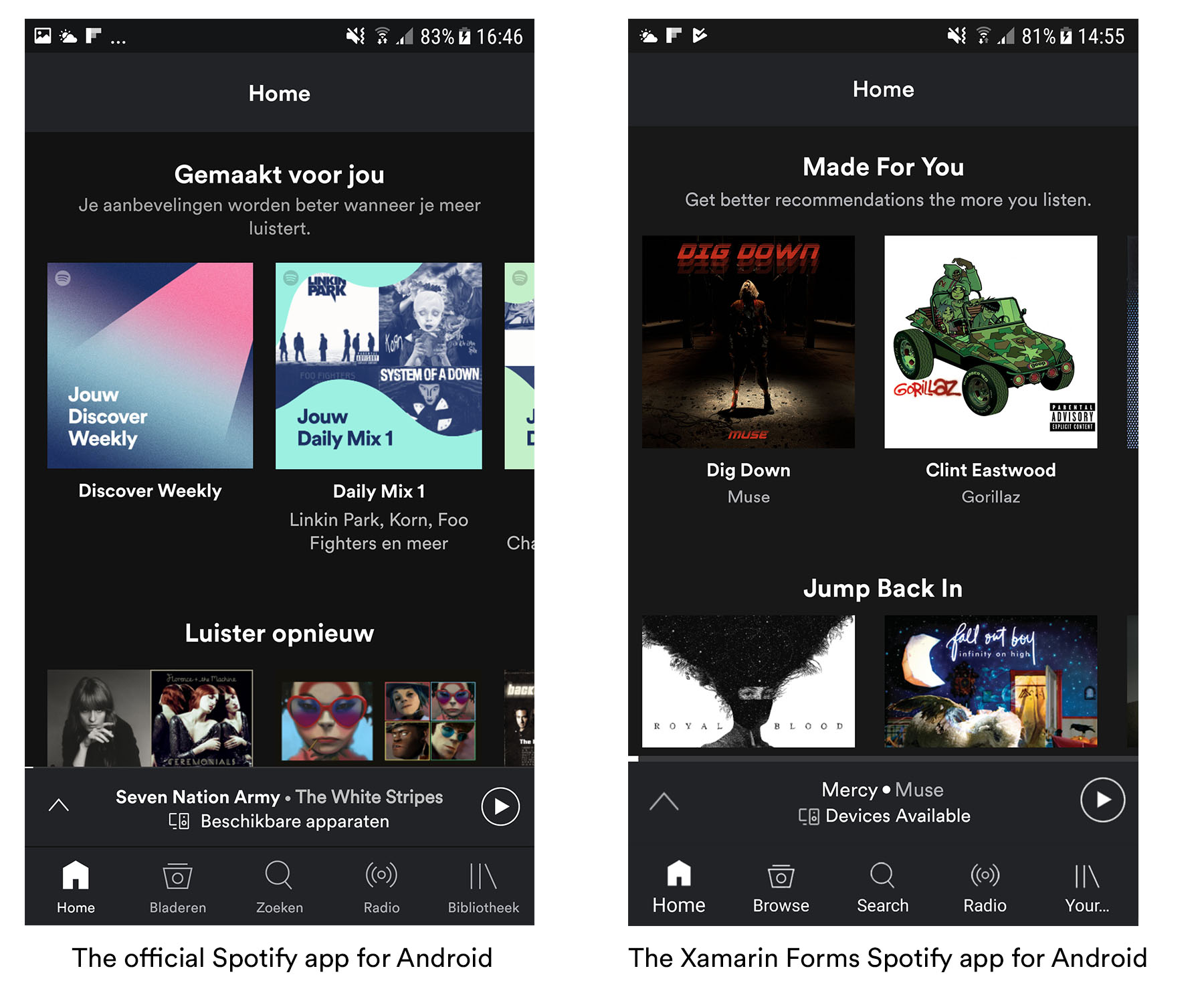
It feels like I might be becoming a broken record that keeps on repeating itself but on Android things were a bit more difficult. I tried styling both the navigation bar and the tab bar to give them a custom font but it wasn’t meant to be. The amount of effort it takes to pull this off doesn’t weigh up to the benefits. So what did I do?
- Horizontal scroll views containing the album covers / playlist covers.
- A tab bar located at the bottom of the screen.
- A custom title view that is only visible on Android.
Horizontal scroll view with album covers
Since we already created a horizontal ScrollView for iOS we simply reuse it here for Android. The only thing we need is a custom renderer to disable the scrollbars and trigger our custom rendering.
Custom navigation bar
Like I said before in this post the Android navigation bar is a tough one to style when you want a custom font or alter the TextView in any way. Even when asking for help online the comment I got back most was “just create your own bar and hide the default one”. That’s exactly what I did. On Android I hid the NavigationBar and replaced it with a custom bar:
Functioning tab bar at the bottom of the screen
The out-of-the-box tab bar on Android sits at the top. There are numerous ways to implement a custom tab bar on the bottom but I went with a NuGet package called BottomNavigationBarXF that is a simple drop-in custom TabbedPage that renders the bar at the bottom on Android and renders as a normal TabbedPage on iOS. Since I’m using FreshMvvm it took a bit more effort, but if you’re using a simple TabbedPage it’s a drop-in replacement.
Creating the player UI for Android
The player on Android has a lot of nuances that make it different from the iOS version. The numbers representing the current song time are situated next to the slider instead of above it. The navigation part also closely matches the iOS version which means that I immediately gave up trying to style the navigation bar on this screen as well and went for a custom bar instead.
- Blurred background image to match the iOS look
- Custom navigation bar containing the titles and buttons
Blurred background image
When you look around online you will find a lot of solutions using Renderscript which is perfectly usable here as well. Adam Kemp has one up on his Github that inspired the solution I used here. The only caveat it has is that it only supports a maximum blur radius of 25. This is not enough for the effect we want to achieve here so a different solution was needed. What I ended up doing is resizing the actual image to become smaller losing a lot of detail in the process and then sizing it back up again. Applying the maximum blur amount to this far less detailed version of the image gave the desired effect!
Custom navigation bar
We once again hide the existing NavigationBar and replace it with our own copy. Nothing too fancy going on here, just a simple piece of XAML that is only visible on Android.
Conclusion
This one actually proved quite a challenge especially the fact that navigation bars seem to be hard to style on both platforms. I struggled with this on the player screen where I couldn’t seem to get that translucent navigation bar on iOS going. It took some time to figure out and I would be lying if I said that I didn’t find the solution by some hit and miss programming. On Android I eventually just gave up and rolled my own wannabe navigation bars.
I know these are not perfect copies but they aren’t meant to be in the first place. This series is first and foremost still a testament to what you can achieve using the techniques that Xamarin Forms puts at your disposal and to show that you’re only limited by either your imagination or the amount of effort you want to put into making your app look good. It takes some tinkering but I’m pretty sure that that’s not different compared to building the app in either the native languages or the Xamarin.Android/iOS platforms.
Since this is the third instalment in the series and I want to keep my content fresh I would like to pose the question if people still want to see this kind of content. Let me know in the comments or reach out to me on Twitter if you like this kind of stuff or if you have ideas about which app UI to tackle next.
Code & tools
You can find the code here: https://github.com/sthewissen/KickassUI.Spotify
The following tools were used to create this app:
- FreshMvvm – Simple MVVM framework – https://github.com/rid00z/FreshMvvm
- BottomNavigationBarXF - A bottom tabbar for Android - https://github.com/thrive-now/BottomNavigationBarXF
- Fody - Framework that the PropertyChanged Fody weaver is built on - https://github.com/Fody
- Fody PropertyChanged - Handles property changed events, ideal for MVVM - https://github.com/Fody/PropertyChanged
- LiveXAML – Live simulator updates for your XAML code – http://www.livexaml.com

