My previous post about creating a fancy Xamarin Forms UI was a whole lot of fun to do and I got some awesome feedback so it’s time for another. Since running is one of my hobbies I see a whole lot of this app up close. It’s both as simple in design as it is functional which makes it a great case for this; Runkeeper!
This is a rather long post, so here’s an index for you to quickly jump to where you want to be.
- Marrying Xamarin Forms UI and Runkeeper
- The Start screen on iOS
- The Me screen on iOS
- The Start screen on Android
- The Me screen on Android
- How much time does it take?
- Speeding up the process
- Conclusion
Marrying Xamarin Forms UI and Runkeeper
I wrote about creating a fancy UI in Xamarin Forms before and already concluded that with a bit of effort you can pull off similar UI’s to when you’re creating a Xamarin.iOS or Xamarin.Android app. As always the code for this is on my Github page so let’s get straight into it.
Note: Runkeeper uses Museo Sans for their text but only the medium weight version of that font is free. Therefore in some places the font for this post will look bolder or less bold than the original.
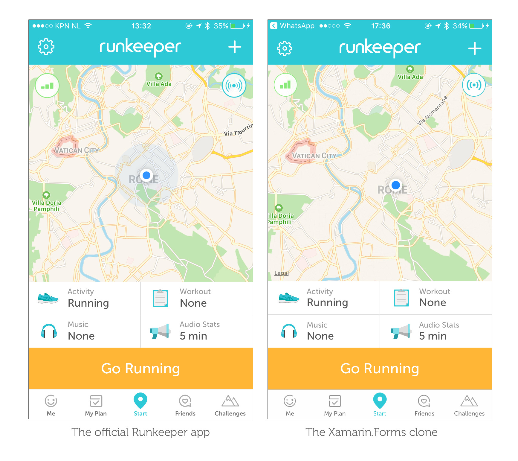
The Start screen on iOS
There’s actually not a whole lot going on at first sight. Some buttons at the bottom, a map and a basic navigation bar/tab bar combination. To recreate it in Xamarin Forms shouldn’t be too hard to pull off either. Using the Xamarin.Forms.Maps NuGet package we can create a cross-platform map and using the same font and iconography as Runkeeper does there is hardly any noticeable difference!
However there are a few notable things happening here. First off on iOS I implemented a custom renderer that does a few things to our tab bar control:
- It changes out the selected images in the tab bar for replacement images instead of simply tinting them.
- It sets a custom font for the tab bar titles.
- The tab bar titles are shifted up a few pixels to match the Runkeeper look.
A second custom renderer takes care of some navigation bar related things:
- When you have multiple toolbar items iOS puts them all on the right hand side of the bar. The custom renderer takes one of them and moves it to the left.
- Set the custom font for the header.
- Set a light statusbar to complement the blue navigation bar.
The Runkeeper logo is only present on the Start tab and the Start tab also has a navigation bar with a different height when compared to all the other tabs. To get this behaviour I created a custom class inheriting from ContentPage. This is what our Start page will inherit from and is only there so we can target that page specifically in another custom renderer. In this renderer we do the following things:
- Add a
UIImageViewwith our logo to theTitleViewofUINavigationItem. - Change the
Framefor the existingUINavigationBar. - Shift the title and icons up a bit because changing the height throws these off-center.
The Me screen on iOS
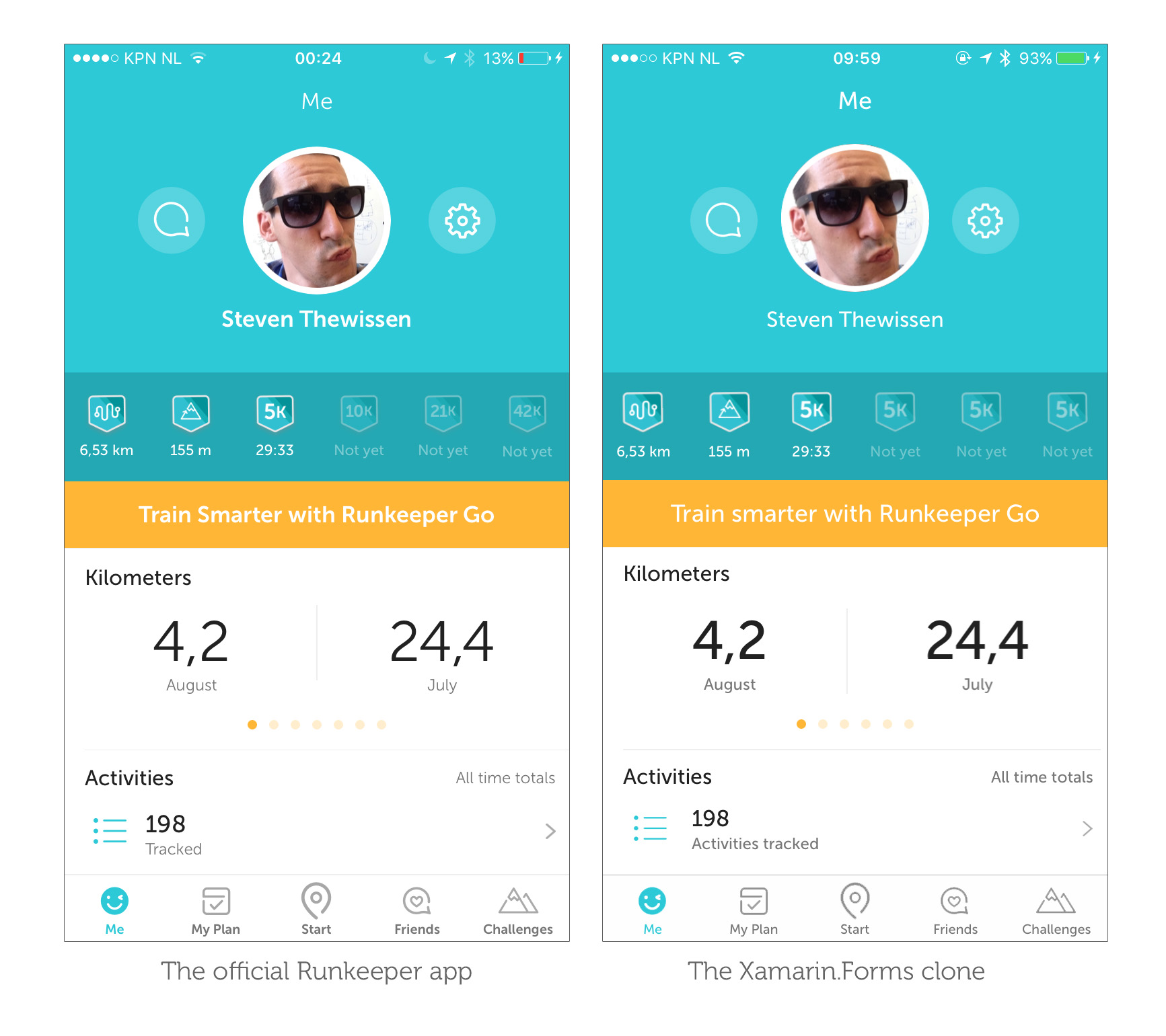
The Runkeeper app obviously has some more screens besides the Start screen. That’s why I also took a shot at the Me screen which also has some interesting parts to it. My tinkering eventually resulted in the following:
So what moving parts do we see here?
- A button with a
BorderRadiusset to half its width to create a completely round button for the comment and settings button. This is a pretty simple built-in way to create a round button. - An image using FFImageLoading and its
Transformationsfeature to create the rounded profile picture with the white border. When you’re working with images this plugin is a must-have. - A carousel view containing the stats which was implemented using the custom-built CarouselView control for Xamarin Forms by Alexander Reyes.
- All the other stuff was created using simple layout controls like the
Gridand theStackLayoutin all sorts of configurations.
The Start screen on Android
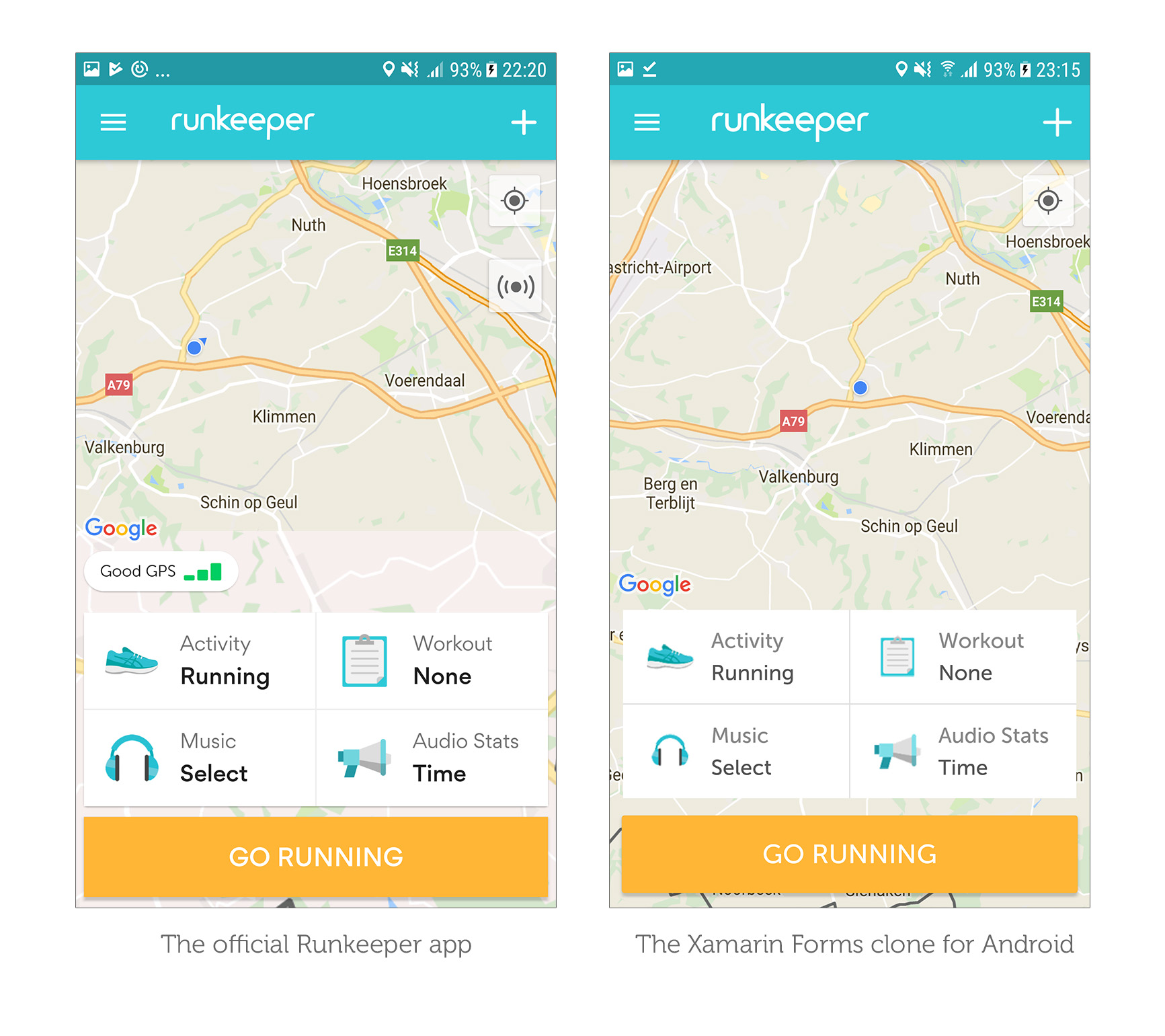
I’ve said it before and I’ll say it again here; I’m an iOS guy. Android confuses me with its plethora of XML files to style your app. I always start with iOS to get it exactly the way that I want it and then move on to Android. I was in for a shock when I first opened the Runkeeper app and saw that it was quite different from the iOS version. Here’s what I ended up with:
The first thing you’ll notice is that the Android version has no tabs. Instead it has a master/detail setup going on. Another thing that you’ll notice is that the map control is full screen with the buttons seemingly floating over it whereas in the iOS app these are separated. Here’s what I did to get this looking similar:
- Changed the
Grid.RowSpanfor the map for Android only using theOnPlatformfeature. Because the map now spans all the rows the map automatically becomes full screen. - Removed the Settings button in code, because we don’t need it.
- Instantiate a
MasterDetailPageinstead of aTabbedPageusing OnPlatform in theApp.xaml.csfile. The actual screens are the same for both platforms. This is no problem for Xamarin Forms!
I also added a platform-specific Margin to the views containing the buttons so the map can be seen and the buttons seem to be floating on top of the map. Because almost half of the map is covered by our buttons the controls on the map (such as the user’s location) need to shift up without disturbing the map itself. This is done through a custom renderer because the native GoogleMap has a Padding property that can be used for exactly this type of problem.
The Me screen on Android
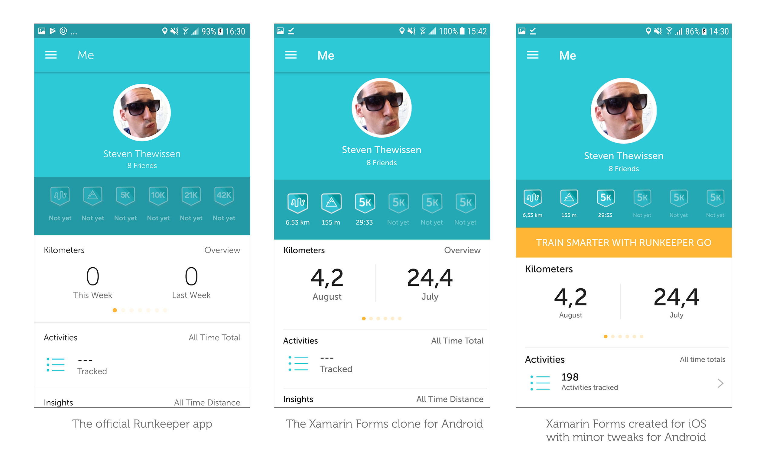
This screen looks a bit more familiar to what we saw in the iOS version. However in my opinion the actual screen in Runkeeper’s Android app looks worse (in my honest opinion) than what Xamarin Forms gives you straight “out of the box”. What do I mean by that? Like I mentioned before I started with the iOS look and feel. Since Xamarin Forms UI is shared across platforms I already had a UI in place for Android when I was done with iOS. This UI looks better on Android (with minor tweaks) than the actual Runkeeper app does. See for yourself:
Some things that were done to recreate this page:
- Use the MessagingCenter to tell our
MainActivityto change theToolbarResourceto a toolbar version without the Runkeeper logo since the logo is only visible on the main page. - Enabled an
elevationproperty on ourToolbarresource to create the drop shadow below the toolbar which makes it look worse if you ask me. - Added a # Friends label which isn’t there in the iOS version for some reason.
- Messed around with some of the paddings, margins and font sizes to mimic the look-and-feel of the Android app.
And perhaps it’s also interesting to note what I didn’t do:
- Change the font for the navigation toolbar. I have yet to find out how to pull that off in Android and it seems like the hoops you have to jump through to pull it off are complete madness. Know the answer? Submit a PR!
How much time does it take?
An argument for native development could be that it takes you more time to create something like this in a Xamarin Forms UI but this only took me about a morning to pull off. It’s all a matter of experience and once you figure out how to do something you can re-use that piece of code in future apps. A custom renderer created to perform a specific task is easily re-usable across any future app you create.
I still firmly believe that the most amount of time is spent in actually designing (placement of elements, colors, which fonts to use, iconography) the app. Whether you’re creating the UI in Xamarin Forms or natively this is time you’re going to have to spend anyway. Actually implementing the UI is not considerably faster or slower either way in my opinion.
Speeding up the process
There are things you can do to speed up your Xamarin Forms UI tinkering process. When you’re constantly adjusting margins and paddings to nudge elements into place compiling and deploying takes a lot of time. There are tools out there like GorillaPlayer, Xamarin Live Player or LiveXAML that greatly simplify this workflow.
For this post I tried LiveXAML and it does exactly what it says on the box. All you need to do is install the extension in Visual Studio and install the NuGet package in your project. Whenever you save any XAML file, it automatically updates the running application. This is ideal to quickly tinker with things like paddings/margins and colors. However when you change things in C# code such as adding a custom renderer you will need to rebuild the app and redeploy to see your changes.
Conclusion
This was a really fun app to recreate and how spot on the result is kind of amazes me. The app uses a lot of default elements to create a really simple yet effective layout and that’s where Xamarin Forms definitely shines. Another thing where Xamarin.Forms shines is its community of very useful tools and controls. Something like the CarouselView in this post is really simple to use and the fact that someone already went through the effort to create it for others to use is awesome.
You can find the code here: https://github.com/sthewissen/KickassUI.Runkeeper
The following tools were used to create this app:
- FreshMvvm – Simple MVVM framework – https://github.com/rid00z/FreshMvvm
- FFImageLoading – Caching and transforming images – https://github.com/luberda-molinet/FFImageLoading
- CarouselView – Carousel control for Xamarin Forms – https://github.com/alexrainman/CarouselView
- Xamarin Forms Maps – Maps control for Xamarin Forms – https://www.nuget.org/packages/Xamarin.Forms.Maps/
- Xam.Plugin.Geolocator - Geolocator to get our current position - https://github.com/jamesmontemagno/GeolocatorPlugin
- Xamarin Forms Toolkit - Some handy things, especially the MessagingService - https://github.com/jamesmontemagno/xamarin.forms-toolkit
- Corcav Behaviors - Some basic behaviors for ListView - https://github.com/corradocavalli/Corcav.Behaviors
- LiveXAML – Live simulator updates for your XAML code – http://www.livexaml.com


