They say that seeing new places can work wonders for your creativity. I’ve recently gone on a trip to Seattle, visiting the Microsoft MVP Summit. With half an hour to kill in between sessions, I started tinkering with another UI sample in Xamarin Forms. This is the result of that.
By now you must know how these posts go, so I won’t be going into a lot of the details. I find a cool looking UI and replicate it in Xamarin.Forms. Everything is open source on Github and I will be picking out some things that are special about this and highlighting how they’re done. Sounds easy enough right?

The inspiration for this post came from the above shot found on Dribbble, which was made by Panji Pamungkas. Not all that you see is part of this little sample, such as the custom tab bar and even though that would be a very fun avenue to explore it’s also a very complicated one. I still want to have fun while doing this. Implementing that would start to look like this was work ;)
The rounded corners
One of the first things that stands out is the use of rounded corners. The header picture has a nice rounded corner on the bottom right with a content panel on top of that, which also has two rounded corners on opposite sides.
This is where my recently developed PancakeView comes in handy. It’s essentially a layout element (based on ContentView) that comes with built-in support for background gradients, rounded corners, borders and shadows. It’s a perfect fit for this part!
 Our end result on Android, with a minor quirk :(
Unfortunately, this is where we run into a small issue. As you can see the bottom right corner isn’t rounded off correctly on Android. This is due to a limitation on Android where, if you want to clip the content inside of a view (the image), all of your corners need to be rounded using the same radius. However, this is not an issue for the white overlay panel because it has no content inside of it that overlays the corners. On iOS this is also not an issue.
Update: An alternative option for this is using FFImageLoading Transformations. This is a library on top of FFImageLoading that lets you render images using individual rounded corners. The code for this can be found in this Gist.
The new CollectionView
This app has two horizontally scrolling sections with content, one for the “Hot places” and one for “Categories”. This can easily be done by using a ScrollView and BindableLayout. However, if you’re willing to venture into the preview bits you will find the CollectionView which is also equally capable of pulling off this kind of layout.
You might be wondering how to use these preview bits. Simply update your Xamarin.Forms NuGet package to the latest 4.0 preview version and add the line shown above to your AppDelegate.cs and MainActivity (before Forms.Init() call). After that you’re good to go!
Keep in mind though, these are preview bits, so there may be things in there that don’t entirely work as they should. Don’t go shipping this in a production app just yet ;)
Creating a dark semi-transparent overlay
You may not even notice this subtle effect on the “Hot Places” images, but there’s an overlay of a black fade from the bottom to the top on each of them. It adds a bit of character and uniformity to the images while also providing a good backdrop for the text to become more legible. So how’s that done?
 The end result on iOS, fancy pants!
Here’s where good ol’ PancakeView comes back in again. As mentioned before it also has a gradient background feature, which we can leverage to achieve this effect. To get this to work we need to cleverly stack two PancakeViews on top of one another. One contains the actual image and creates rounded corners. The other one is overlayed on top of that and creates a gradient background going from black to transparent.
 The composition of layers creating the overlay effect
The shot above shows how these two PancakeViews are layered on top of one another to create the effect. It’s a really simple solution but it adds to the overall experience. The code for it is this little snippet right here:
Let’s have a chat about icon fonts
If you’re not using an icon font yet to render out all of your icons you really should consider it. There are numerous of these fonts out there such as FontAwesome that you can freely use which offer you a wide range of icons. I use FontAwesome to create the notification bell icon, the rating stars and category icons in this UI sample.
But why use a font instead of images? Fonts are vector-based which allows you to infinitely scale them without any loss of quality. It also allows you to use all 16 million colors available to you to tint your icon, whereas using images you’d have to create separate images for all of these occasions.
Using custom fonts is always a pain in the ass, so I recently reached out to Matthew Robbins of MFractor fame to see if we could improve that. Within weeks he came up with this brilliant solution: a Font Importer! This is now part of MFractor and greatly simplifies the workflow around using custom fonts, so you should really give it a try!
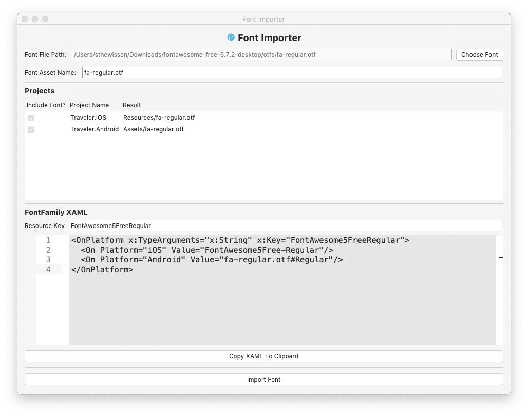 The new Font Importer in MFractor
Code & tools
You can find the code here: https://github.com/sthewissen/KickassUI.Traveler. If there’s something in there that you think can be done better in a different way or found a bug; feel free to submit a PR. I’m always looking to learn :)
The following tools were used to create this app:
- MFractor – Productivity tools for Visual Studio Mac – https://www.mfractor.com/
- LiveXAML – Live simulator updates for your XAML code – http://www.livexaml.com
- PancakeView - Layout element with additional features - https://github.com/sthewissen/Xamarin.Forms.PancakeView


