A lot of apps currently in stores have some sort of walkthrough or tutorial screen that walks you through the basic functionality of an app. Let’s see what kind of things go into making one of those shall we?
Code for a really simple tutorial screen…
Let me start of by saying that the code for this tutorial page is definitely NOT very impressive. There you go, I said it. It really isn’t. I firmly believe that a major part of the effectiveness of an in-app tutorial comes from a proper use of images and a minimalistic approach. No one wants to read through a wall of text so when a few one-liners can clearly educate people on what the app they’re using does the more effective the tutorial is.
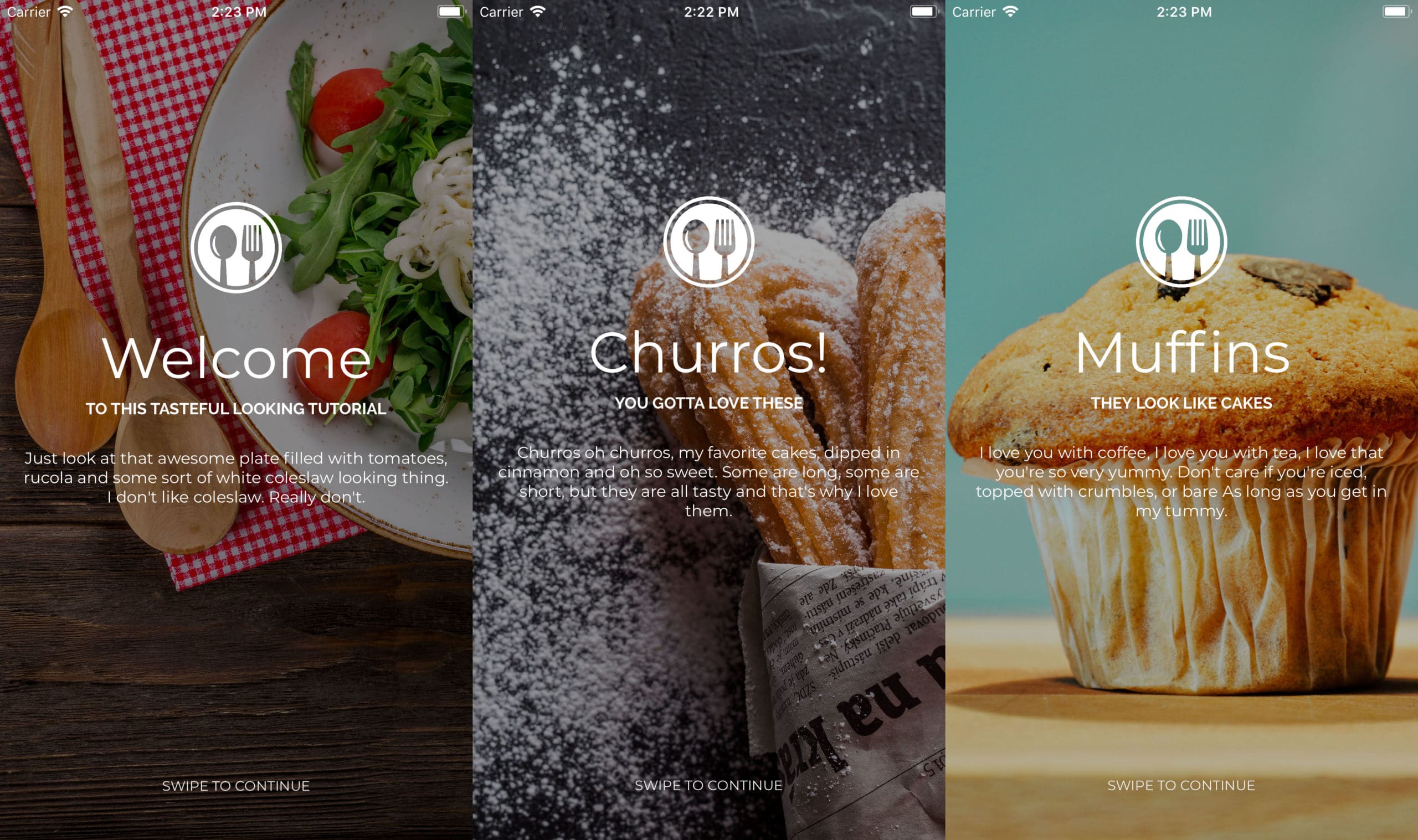
I gave myself half an hour to create a simple tutorial for a fictional food related app and this is what I came up with. Obviously good-looking UI is a matter of taste (just like the food pictured below) and you might not find this as aesthetically pleasing as I do but it serves its purpose if you ask me. What went into creating these screens? Not a whole lot:
- Grab a few food related pictures from Pexels
- Add a simple food related logo
- Write some text that describes what the app can do
- Put it all into a carousel view to tie all the screens together
- Add a small incentive for the user to make him understand how to proceed (Swipe to continue)
So as you might expect the code is not quite complex (full source code):
Taking it a bit further
This stuff is all pretty basic. You could give it a bit more “oomph” by adding some additional effects in there like for example a parallax. There’s something about parts of a page not scrolling the way you’re used to see them scroll that gets the blood pumping. I especially like what Nike does in this sample:

So why are we doing this?
You’ve seen how to create a simple looking tutorial, but why even bother There must be a point to investing so much time creating a screen that half of your users will not hesitate to skip within a second. The keyword here is onboarding. The tutorial screen is important for a few reasons:
- Enables you to explain to a user why he/she needs your app in their life
- Gives you an opportunity to create a highlight reel of your features
- Explains the features that are a bit harder to use
- An ideal starting point for developers to ask for permissions
Why do I need it and what does it do?
If there’s one thing that we know for sure in the world of mobile apps it’s that a user can uninstall your carefully crafted app within a second. That’s why you need to make a good first impression. The tutorial screen is the place to start. Be clear about what your app can do for the user and your chances of survival instantly increase.
Because the tutorial screen tells the user how to use your app it is also the place where you can highlight the features that separate this app from the rest of the pack. It’s also a great place to quickly explain the features that are a bit harder to figure out. Completing a tutorial instantly gives your users a sense of accomplishment.

Those pesky developers and their demands…
With privacy laws getting stricter there’s a lot of things in your phone that an app developer can’t access without your permission.Whether it’s your camera, photo library, GPS location, microphone or contacts; we want them all! Obviously asking for permission is a good thing, but it also means that developers have to think about this from a usability standpoint more and more. The tutorial screen is a great entry point where these permissions can be asked and checked.
Conclusion
Though the tutorial screen might not seem like much it has a pretty important job to do. You might be the kind of guy that instantly skips it and doesn’t pay any attention to it, but not all of your users are created equal. Creating a good tutorial screen is definitely worth your time and effort to get as much users as possible on board.


