Neumorphism (or neuomorphism) might be a word you’ve never heard before. If that’s the case, then this is the blog post for you! We will take a peek at what it means and how we might be able to achieve it in Xamarin.Forms.
It’s hip, it’s cool, you need it in your life!
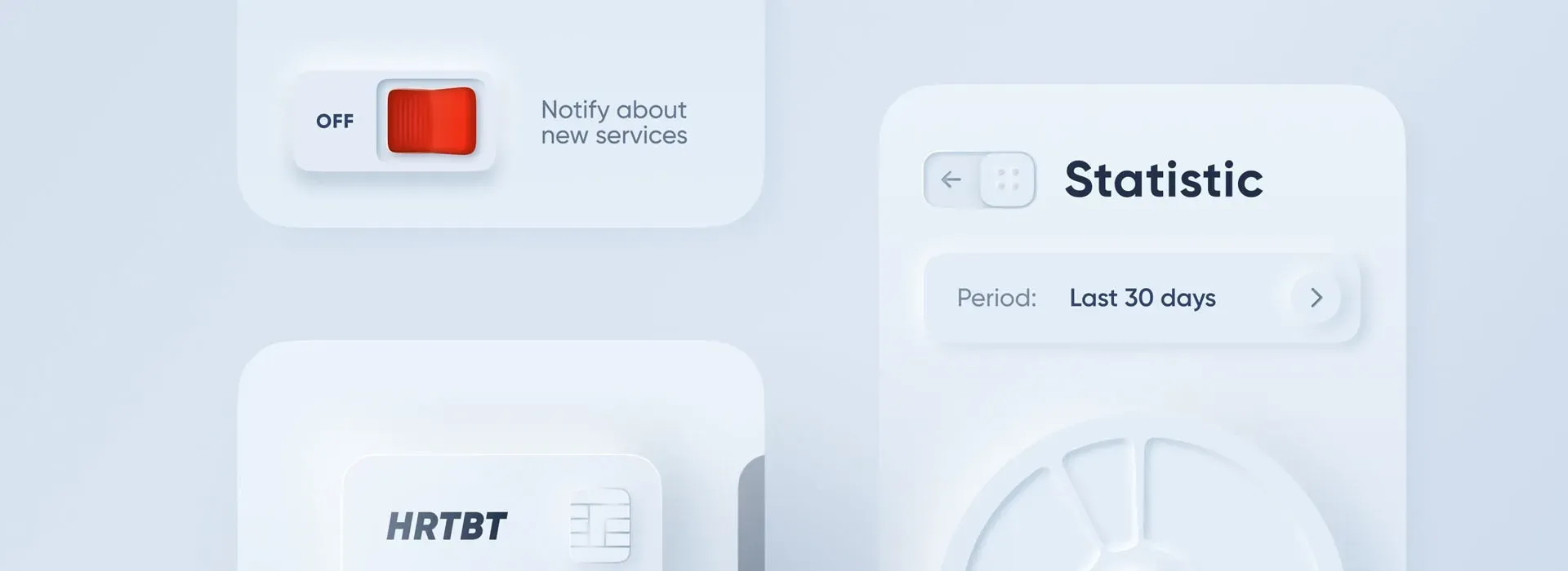
Every once in a while a new trend arises in the world of design. Who doesn’t fondly remember Apple’s skeuomorphism where everything had to mirror something existing in real-life back in iOS6? That leather-bound notepad that made you feel like you had made it, or the neatly ordered bookshelf showing off your reading prowess. After that came the minimal flat design that we still see around to this day. However, something else has been sweeping the internet lately and it’s called neumorphism. This is how it looks:
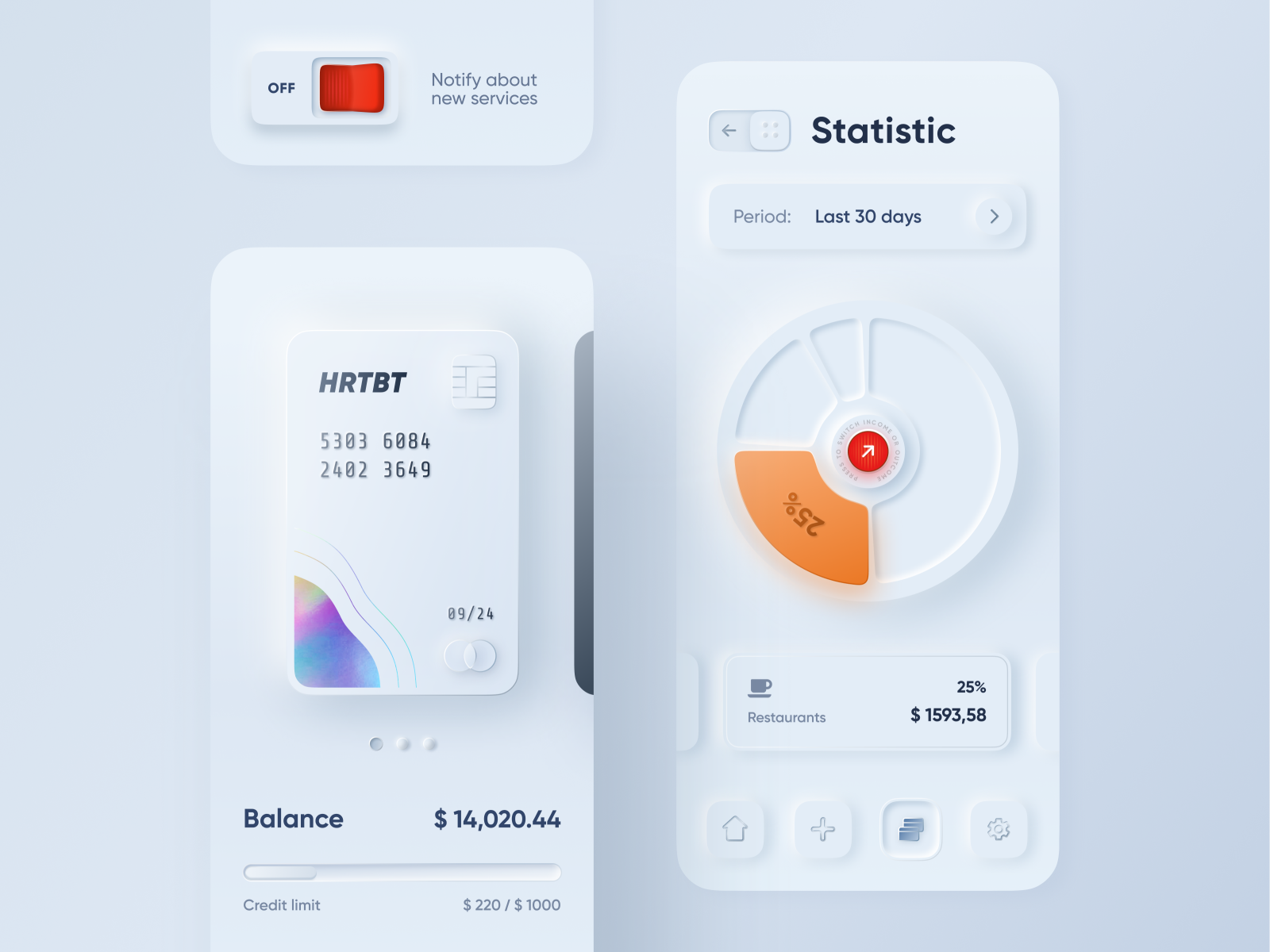 The Dribbble shot that started it all by alexplyuto.
I would describe it as minimal flat design with a bit of skeuomorphism sprinkled on top of it. The use of shadow to mimic light makes the elements pop off of the page as if they are bursting through and exist in the real world.
But isn’t this just Material Design in a way?
You might ask yourself that question and surely, some similarities come to mind. Material Design also uses cards that cast a shadow to indicate that they are floating on top of the surface and casting a shadow. In the case of neumorphism though, one could say that the card seems to be protruding from the surface. However, due to the way Material Design is set up it might prove a challenge implementing this effect using Xamarin.Forms.
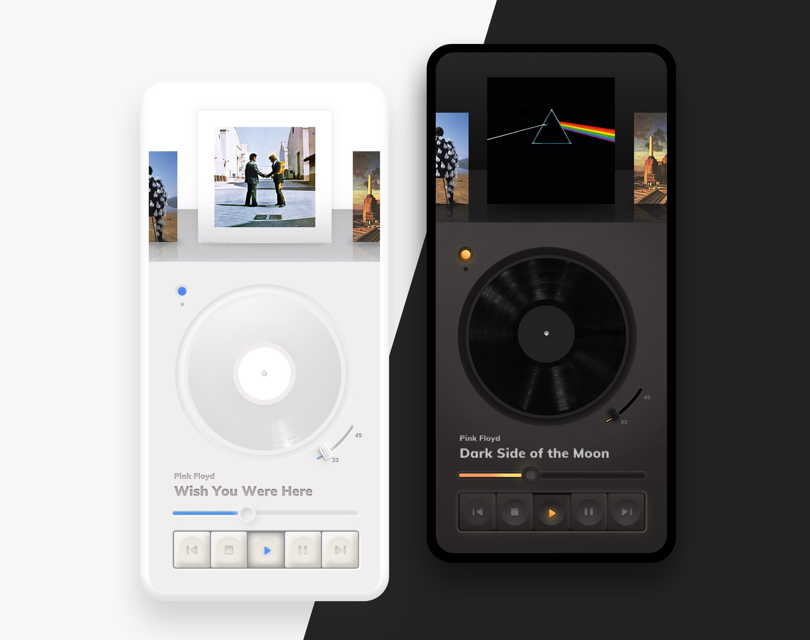 Another sample of neumorphism as featured on https://uxdesign.cc/
Looking at the basic building blocks
What will it take to get started making neumorphic interfaces ourselves? Let’s take a look at the basic components, which are pretty simple in and of itself. Looking at a simple card we can see that we need a slight grey tone as our page’s background to contrast with the light highlight shadow. The card itself has the same background color and boasts not one but two shadows! A light shadow casting to the top-left corner and a darker shadow casting to the bottom-right corner. These simple components compose the basics of the style, which can obviously be experimented with further in different shapes and forms.
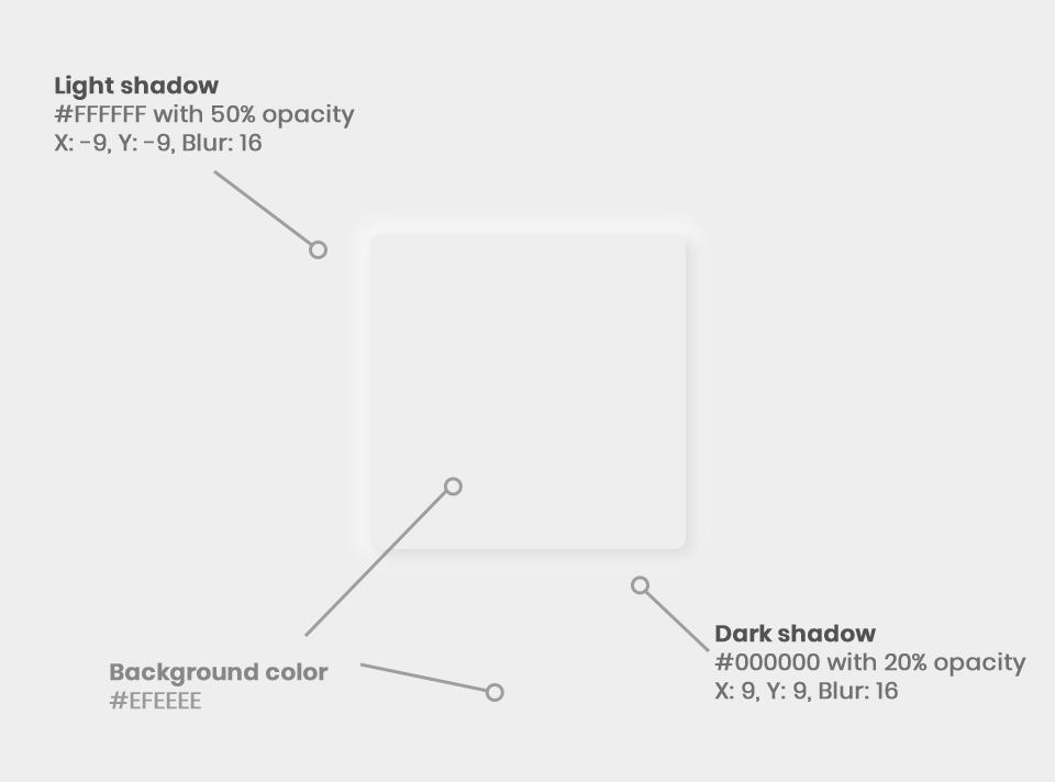 The base components of the style.
Implementing neumorphism in iOS
Now let’s take a look at how we can implement neumorphism in our app, starting with iOS. On iOS we have a lot of control over shadows, which makes it a fairly straightforward process to implement the base effect. By adding CALayer objects to our native iOS views we can add both a top and a bottom shadow with ease. Here I’m creating a new NeuContentView which inherits from ContentView and add a custom renderer for it that adds the necessary layers.
This is what the resulting view looks like with a similar renderer applied to a button as well. I also added an inverted pressed state to the button for good measure. The complete source code for this can be found on my GitHub.
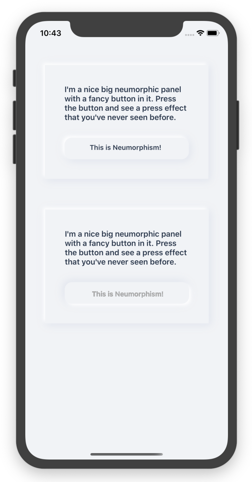 A neumorphism panel and button in our little Xamarin.iOS app.
What about Android?
Here’s where things get a bit tricky. Whereas a designer can simply tweak a few sliders, mess about with a radial dial and be done with it, we as developers need to do some more work to get this to look just as good. Material Design shadows work very well, but also in a very specific way.
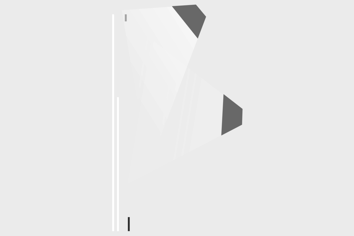 How lighting and shadows work in Android.
The Android Material Design system consists of two light sources, a key light, and an ambient light. They have a fixed position, so the shadows cast by the different layouts of your app look uniform across the platform. There are ways to change the positioning of these lights, but they are considered very hacky. It also wouldn’t allow for the dual shadow effect that makes this whole style work. So on Android, we are kind of stuck, at least from a native perspective.
 An Android developer implementing neumorphism.
But I really wanted these in my app!
If we can’t draw these things natively, we have one other option: use a drawing library. On Xamarin (and other platforms) we can use SkiaSharp for this. It gives us complete freedom in drawing shapes and shadows, so it’s probably the best bet to get this running cross-platform. I have not ventured into building an implementation of it yet (more details about that in the next paragraph), but other brave souls have:
making some progress on #neumorphism design in @dotnet. kudos to @mattleibow for the #skiasharp fiddle - it’s an amazing dev cycle for prototyping pic.twitter.com/sTSfabV5AC Johnny ⚡️ (@johnny_leo) February 26, 2020
Let’s address some concerns
Yes, it looks flashy, hip, new and we want it everywhere! You could say that, but let’s think a bit longer about this. And more specifically from an accessibility standpoint. Because while it may look very nice, it definitely has some issues in that department. I’m no expert in the accessibility field, but there are a few problems we can spot straight from the get-go.
The W3C has created a set of accessibility guidelines known as the WCAG. These have become an ISO standard and also cover mobile devices. It uses the three levels of conformance (A, AA, AAA) and websites of public sector bodies have to legally conform with WCAG 2.1 Level AA in the European Union.
Visual issues
One thing that immediately stands out when looking at examples of this visual style is a lack of contrast. Elements need to have the same background color as their parent for the visual style to work, meaning they are only distinguished by their shadows. Because you and I sometimes venture outdoors and use our mobile devices while out and about we run into an additional issue: sunlight. Screen glare and a lack of contrast do not play together nicely. Imagine how an already visually impaired user will be affected by this.
Contrast ratios have been defined in the WCAG standards for each of the conformance levels, and it’s safe to say that neumorphism in it’s most basic form doesn’t score very well in this area.
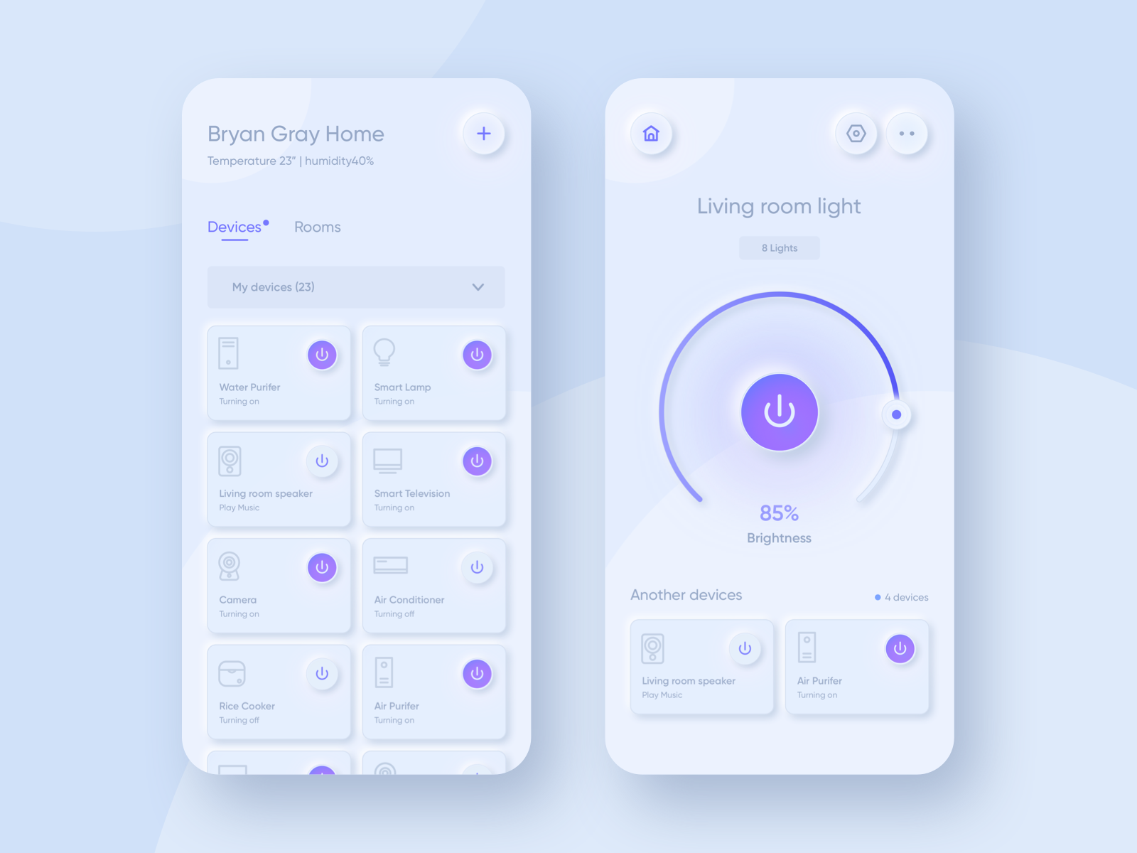 Neumorphism and its lack of contrast seem problematic for accessibility. Shot by Nugraha Jati Utama on Dribble.
Hierarchical issues
The screenshot above highlights another issue with the style: everything tends to be very uniformly styled. Nothing stands out in particular, so there’s a lack of hierarchy on the screen. Quickly finding the things that are most important becomes problematic, meaning that your decision-making process is hindered. For people in the autism spectrum, this could become a problem.
This uniform styling also creates confusion because the usual distinction between things you can tap on and things you can’t tap on is missing. Buttons trigger actions and UX designers tend to want to highlight these because they help the user achieve a goal. Confusing your users, however, has never been the foundation of a good user experience.
In closing
So is this thing dead in the water? Not necessarily. It’s a style that sprung from a single Dribbble sample and people have just started to give their own spin to it. If it does manage to catch on it has no choice but to evolve further and tackle some of the problems it currently has to be a sustainable design trend in the future. For now, I would just enjoy its fancy visuals :)

