Have you ever had a scenario where using the built-in navigation bar and other UI elements simply didn’t cut it? Perhaps it’s been suggested to you by a designer that the default elements are just ugly. Simply roll your own and start using a base page!
About this post
You may have seen or read about #XamarinUIJuly on my blog already. It’s a series of blogposts where every day of July a Xamarin community member posts a blog about Xamarin and UI. This is my blogpost in the series! Click the shiny badge below to view the entire schedule containing the posts up until now.
 Click it! You know you want to!
This post combines one of my favorite activities, creating good-looking UI, with a technique we’re using in our apps today. We have a lot of designers coming up with the craziest ideas where having to implement them using the native controls just isn’t feasible. This is why we started exploring the topic of creating a base page from which all pages in the app inherit. It allows us to have a unified style across each page while still allowing us to have a lot of customisability.
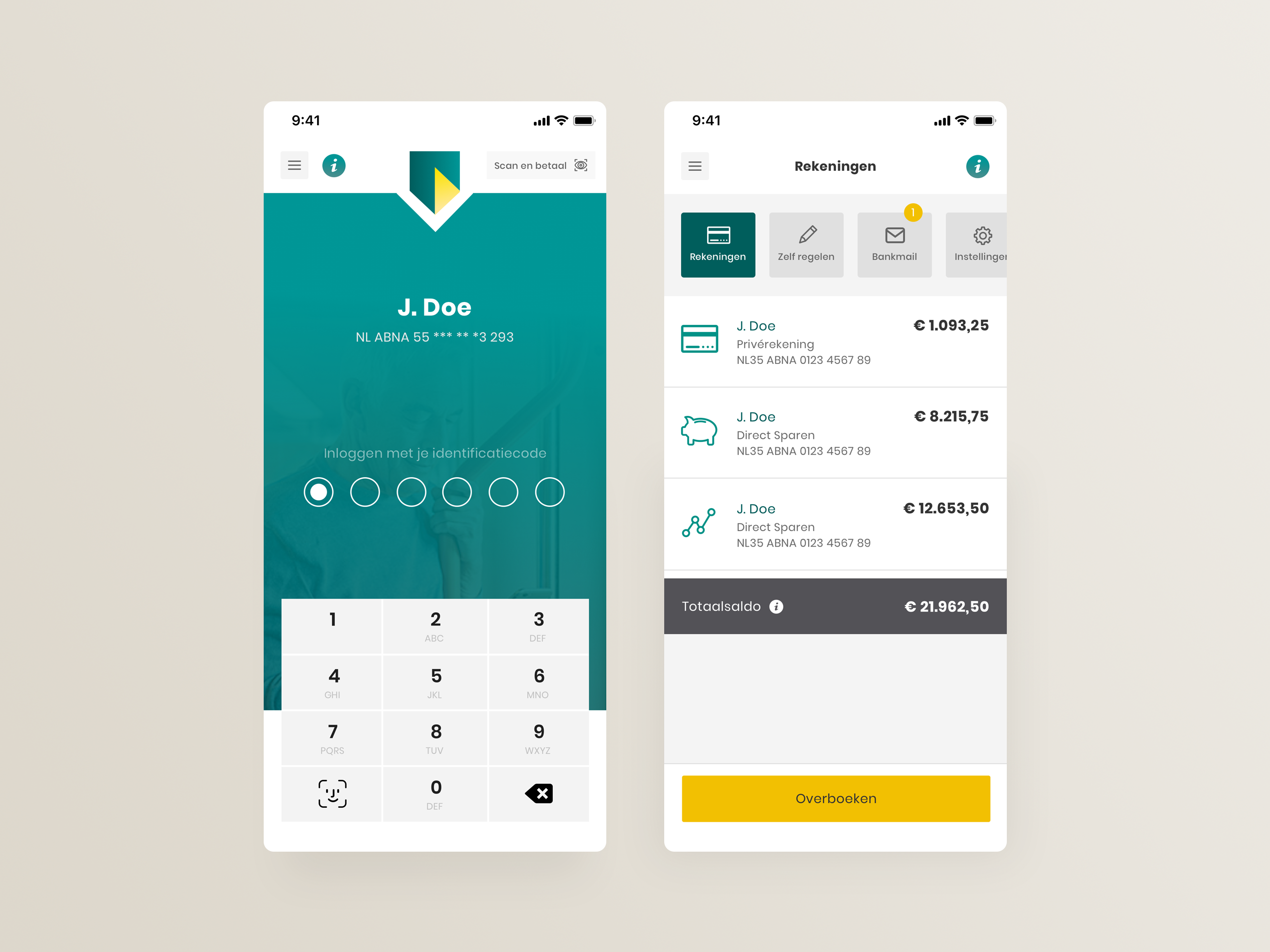
A look at what we’re creating
In my travels around the internet, I recently came across this app redesign for ABN AMRO. This is a bank here in The Netherlands and the redesign was done by Ruben ter Hoeve, who decided to re-imagine the existing app. This is not an official design in any way, but I liked it quite a bit and I think it can be a good case for the base page concept. So let’s get cracking!

Explaining the basics of a base page
Since we’re rolling our own base page we can make it as complex as we like. Let’s start with a basic setup first though and build on that. We start by creating a XAML page in which we will build the UI framework of the app. In this sample, the part that we’re interested in abstracting into a base page would be the navigation bar.

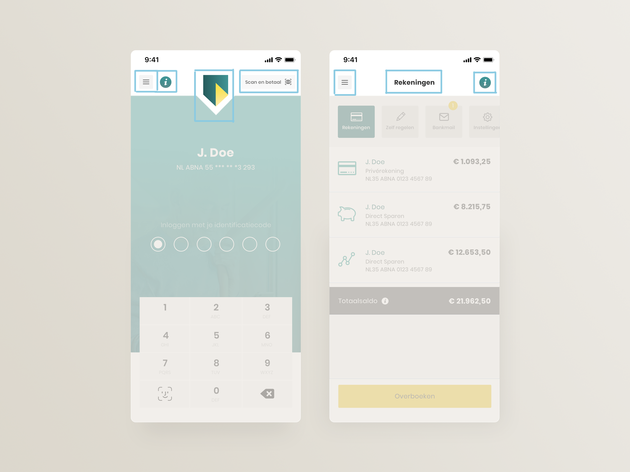
This navigation bar already has a few areas that we can deconstruct:
- A hamburger menu.
- A company logo, cleverly overlayed onto the content.
- A title, visible on subsequent screens.
- A left-side content area.
- A right-side content area.
Blocking this out in XAML we end up with a structure similar to the one below. Both the left and right-side content area consist of a horizontally oriented StackLayout. The logo is an image that we can position the way we need it to be by applying some simple layout constraints. The hamburger menu is a fixed button on the base page so it will show on each and every page.
Making it all dynamic
Now that we have our base page set up we need to figure out a way to influence some of the controls within it from a subpage. Earlier, we created 3 areas that are dependent on the page we are showing: the main content area and the left/right navigation bar areas. You might’ve noticed that I gave all of these an x:Name attribute so we can use them from code-behind. By adding a few properties to the base page we can make these areas available to all pages inheriting from our base page.
So what’s happening here? We set up 3 properties, all of which are pointing towards the Children collection of the dynamic areas we’ve named in our XAML file. What this means is that each page inheriting from our base page now has access to these areas through this property effectively enabling all your subpages to provide custom implementations of them.
How does this look in code? The sample below should illustrate how we can use these properties on our subpages to provide content.
How to show the logo… or not?
One of the things I’ve mentioned already is that the logo is there on one page and gone on the next. Let’s look at that for a few minutes, since it’s not the hardest thing to pull off. The simplest solution is to create a property on BasePage to hide the logo and show the title label instead. By making it a bindable property we can even bind it to show/hide the logo at runtime.
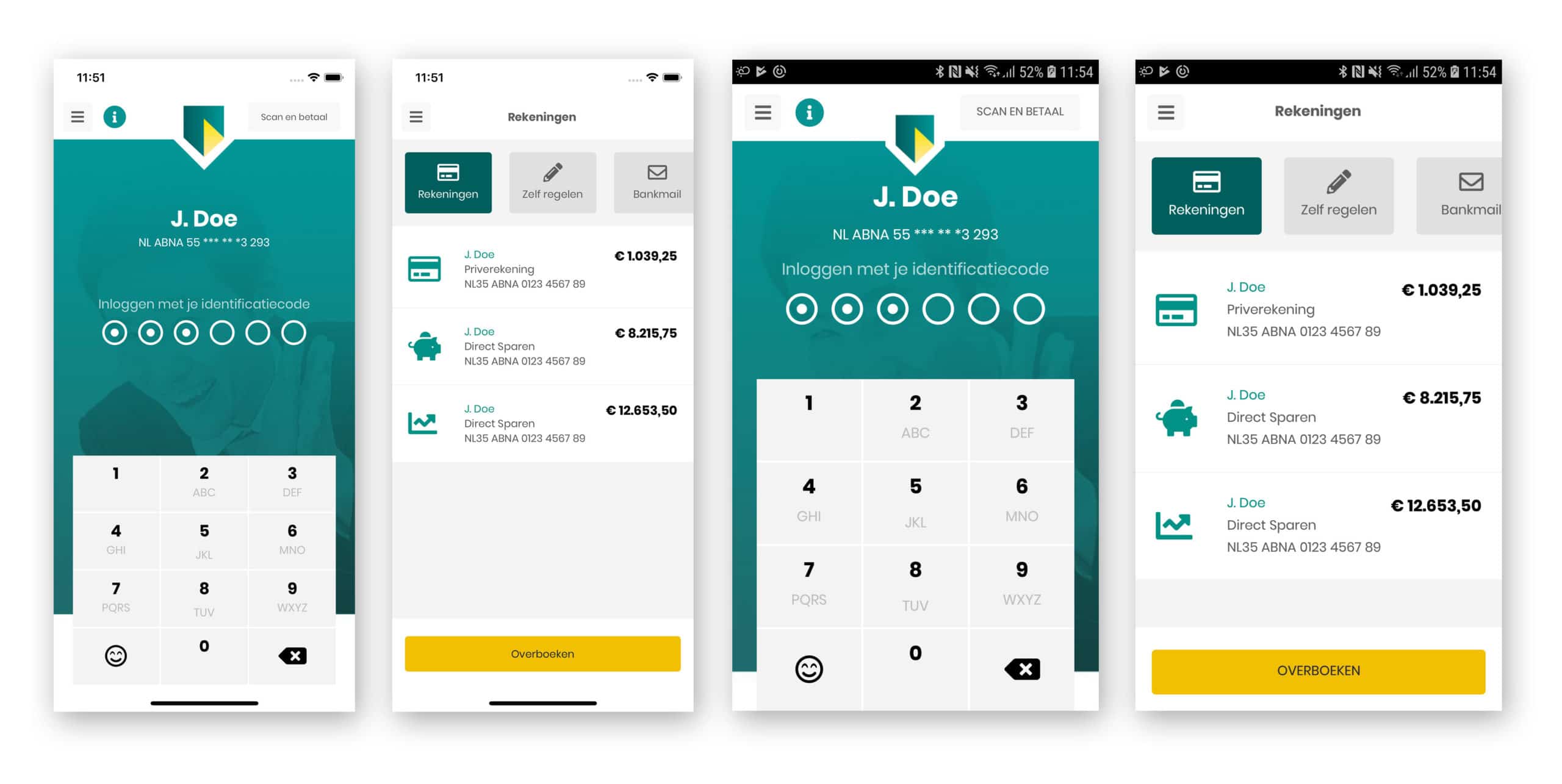
The end result
Most of the rest of the app consists of basic Grid and StackLayout controls. By using an icon font we can get close to the icons used in the design, but the font I chose didn’t contain exact matches for everything. It does a good job regardless.
 The end result.
Conclusion
Obviously, the base page method also has a few drawbacks. Handling when to show a back button on a page or a close button on a modal is something that you will need to implement manually. These are challenges that are fairly easy to overcome, but they do make this setup a bit more complicated at first.
On the flip side, you do have more control over everything that happens in your app. If you have a designer on the team he or she will be forever grateful for being able to go completely wild with the design without you limiting his/her possibilities by only using native controls.
Source code for this post can be found on Github. The following tools were used to create this app:
- MFractor – Awesome productivity tooling – https://www.mfractor.com
- LiveXAML – Live simulator updates for your XAML code – http://www.livexaml.com
- Xamarin Essentials - Common cross-platform APIs - https://docs.microsoft.com/en-us/xamarin/essentials/
- PancakeView - View supporting lots of fancy UI things - https://github.com/sthewissen/Xamarin.Forms.PancakeView
- FreshMVVM - MVVM framework - https://github.com/rid00z/FreshMvvm

