
Recently I’ve picked up a few little projects again after having been on a hiatus of sorts. I noticed I hadn’t blogged for a while either, so it’s time to kill a few birds with this one little stone in my hand, eh?
I came across the issue of my Android icons not looking very fly when I was working on my MVP app. You can tell in the screenshot of the springboard below that one icon kind of stands out a lot. And it looks awful. So my goal for this post is to describe how we can fix this! The code for this can be found in this PR on the GitHub repo. So if you want to get started, you can probably gather a lot of the code needed from there.
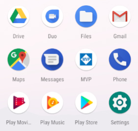 Ugly springboard much?
The story behind adaptive icons
Adaptive icons were introduced in Android 8.0 (Oreo, or API Level 26) already. So I might’ve been living with a horrible icon for a while now. Their use as a new icon format is to cater to the different shape varieties that device manufacturers like to include in their Android version. Some devices prefer round icons, whereas others might favor a rounded rectangle type design. Adaptive icons solve these discrepancies by creating a layering system, where the actual subject of your icon sits on a different layer that gets overlayed on top of a round or square icon surface.
Getting our icon to play nice
This post assumes you already have a PNG version of your icon’s subject and won’t go in-depth into making that icon.
The first thing we will do is add that icon to our app. It needs to reside in the mipmap folders of your project. This is a folder structure that will want to get your image in various sizes, so it can be shown correctly in the various places on your device that your icon shows up. I named its mvp_logo.png in this case.
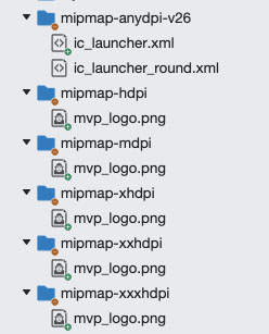 To mip or to map?
Next up, we will create a folder (if it doesn’t already exist) named mipmap-anydpi-v26 within our Resources folder. In this folder, we create two empty XML files named ic_launcher.xml and ic_launcher_round.xml. These will contain our icon definitions for the various scenarios.
Put the following into both of these files:
In this piece of XML we are setting both the foreground and background layer of the icon. In this scenario, we set the foreground drawable to the logo we just added and the background drawable to a color defined in our colors.xml file. These two layers are displayed independently from one another, which allows the device to show the proper combination of drawables. This separation into different XML files also allows you to specify a completely different icon for the round version, if you so please, but we will not be doing that here.
Putting things together in our app
We have no successfully defined our new icons, however, we still need to instruct our app to use them. We do this by putting two additional keys into our AndroidManifest.xml file; on the application key.
We add both a android:icon and android:roundIcon key and point them to the two XML files we created earlier. This tells Android to use either of these resources to correctly display our icon depending on the device’s preference. Also, if you have any icon definitions set up in your MainActivity.cs file be sure to remove those as well. The result of our hard work can be seen below. Much better!
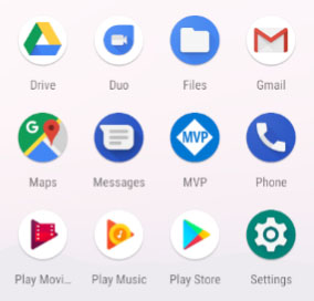 Nice springboard much?
Supporting devices below API Level 26
As this technique was only introduced in API Level 26, it will not work for any Android versions below that. If your app needs to support these versions, you will need to bake both round and non-round versions of the icon into a PNG image and put that in the various mipmap folders. By naming these icons ic_launcher and ic_launcher_round like we did above, they should get picked up by Android instead of the adaptive icon versions.
Making things even easier for you!
Luckily, the internet wouldn’t be the internet if there weren’t some kind of generator to help you skip a few of these tedious steps. One that I’ve found that work pretty well is the one over at EasyAppIcon. This will allow you to upload a PNG of your icon’s subject, choose a background color and will then generate all these XML files for you. It also includes baking them into PNG versions to use on devices on API levels below 26. Thanks internet!
Conclusion
First impressions matter, and pretty much the first thing a user will see is your app icon. By not supporting adaptive icons chances are that a user will see a suboptimal version of that icon. Using a few lines of code and by letting online tools do the heavy lifting, we can add a cool adaptive icon in a matter of minutes. If you’re not supporting them yet in your app, well… what are you even still doing here?